Today, we are thrilled to do something a little bit different. We’ve got not one, but a whole set of smugglerific covers to reveal. The title is Countdown City by Ben Winters, sequel to 2013 Edgar Award-winning science fiction mystery novel, The Last Policeman.
Before settling on the final cover for the book, Countdown City (older working title: Disasterland) went through the following awesome designs. AND we’ve got the designer from Quirk Books, Doogie Horner, here to talk a little bit about each of these and his thoughts behind each image.
Without further ado, BEHOLD: The Smugglerific (Alternate) Covers!
Alternate Cover 1
Doogie’s Thoughts: [Disasterland] was before the title changed to Countdown City. I had an idea to make a blood spatter in the shape of North America. In retrospect, it seems contrived, but at the time I was in the manic grip of that idea and was convinced it could be made to look cool. I spent a LOT of time trying to make it work, but visually it didn’t convey the mood of the book.
For a novel cover, it’s usually more important to convey mood than concept, but since this is a high concept novel, I was fixated on communicating both.
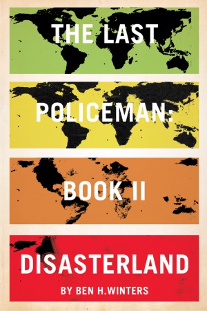
Alternate Cover 2
Doogie’s Thoughts: The color bars align with the danger level colors as the map disappears. The cover communicates the global scale of the impact, but since the story only takes place in a few locations—the immediate narrative doesn’t actually span the globe—this was wrong. Also looks too much like a pandemic story.
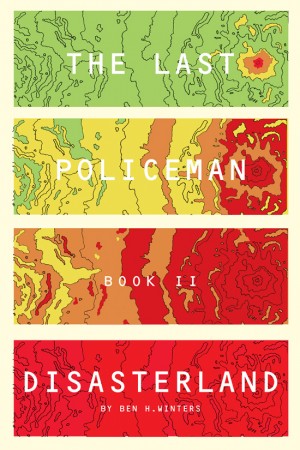
Alternate Cover 3
Doogie’s Thoughts: I love the way this one looks, but it says “pandemic” even more than the previous cover. Doesn’t communicate mystery much, although I was hoping it looked a little like a bullet wound with slowly spreading blood.
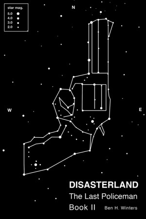
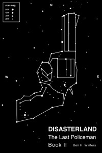
Alternate Cover 4
Doogie’s Thoughts: I really patted myself on the back for this cover. I was totally convinced it communicated both sci-fi and mystery. Still baffled by its rejection.
Alternate Cover 5
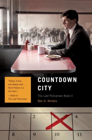
Doogie’s Thoughts: I started using photos which ultimately led to the current design. This cover communicated the civil unrest that permeates the story, but ultimately we wanted a cover that said “mystery” more than this one. I was also still using the type treatment for the first printing of the Last Policeman, and after this cover we ditched that constraint which really freed things up.
About The Book: (Final cover art, title, and synopsis)
There are just 74 days to go before a deadly asteroid collides with Earth, and Detective Hank Palace is out of a job. With the Concord police force operating under the auspices of the U.S. Justice Department, Hank’s days of solving crimes are over…until a woman from his past begs for help finding her missing husband.
Brett Cavatone disappeared without a trace—an easy feat in a world with no phones, no cars, and no way to tell whether someone’s gone “bucket list” or just gone. With society falling to shambles, Hank pieces together what few clues he can, on a search that leads him from a college-campus-turned-anarchist-encampment to a crumbling coastal landscape where anti-immigrant militia fend off “impact zone” refugees.
The second novel in the critically acclaimed Last Policeman trilogy, Countdown City presents a fascinating mystery set on brink of an apocalypse–and once again, Hank Palace confronts questions way beyond “whodunit.” What do we as human beings owe to one another? And what does it mean to be civilized when civilization is collapsing all around you?
You can read more about the book online HERE, and check out the book trailer for The Last Policeman (book 1) HERE:
The Excerpt:
Countdown City: The Last Policeman Book II (Excerpt) by QuirkBooks
You can also read the excerpt online HERE.
Giveaway Details:
We have a copy of The Last Policeman, Countdown City PLUS an exclusive print of one of the alternate covers above (alternate cover #4, the gun and stars image) up for grabs! The contest is open to addresses in the USA and will run until Sunday, July 21 at 12:01am. To enter, use the form below. Good luck!





23 Comments
Erin
July 11, 2013 at 12:42 amThe Fifth one. It really sets the mood and plays off of the book title. Plus it’s an interesting close up of a Molotov cocktail.
Lexi
July 11, 2013 at 12:54 amI like Cover 3 because it does look like an epidemic book. However, if that was not intended for this book, I understand the issue.
Devon
July 11, 2013 at 1:32 amI like the second one–it’s so bold, definitely something that would catch the eye on the shelves.
Mihai A.
July 11, 2013 at 3:47 amThe first two work the best for me. Lately, I find myself more and more attracted to the more simple, but telltale covers. There is something about the first two that makes me pick the book up, without giving away too much they still intrigue me enough to make me want to read the book. Of course, looking over the cover of the first “The Last Policeman” book the final choice follow the line of the series and that is a very good thing. Personally, I still would have liked to see the simplicity of the first two covers on both novels. 🙂
Katharine
July 11, 2013 at 7:25 amDefinitely Cover 3 – the color progression is exciting and I like the topo map feel.
Mary Anne
July 11, 2013 at 8:58 amI like the map covers, just because I love maps, but the more I looked at the gun constellation, the more I liked it, and the little countdown in the corner was clever.
evie
July 11, 2013 at 9:03 amCover 2 is my favorite, but all of them I think set different expectation for the story of this novel.
LeAnn
July 11, 2013 at 12:53 pmThese sound like great books. I really like cover number 2, because I’m assuming it’s supposed to remind me of the odd Homeland Security color system, like Code Orange, Red, etc.
jennie
July 11, 2013 at 5:13 pmI am fascinated with patterns to be found when connecting the dots and thus my favorite is #4, the constellation with gun.
Barbara Elness
July 11, 2013 at 6:54 pmI like Alternate #2, I’m not sure why – I think it’s the bright colors and the maps.
Victoria Zumbrum
July 11, 2013 at 9:39 pmI love the 5th cover. It just seems to go so much better with the book. Thanks for the giveaway.
sarac
July 11, 2013 at 10:11 pmI actually really like the final cover, but cover 1 ain’t bad either.
hapax
July 11, 2013 at 10:13 pmI love the gun/constallation cover, but it might be a little too close to a spate of recent starscape covers (AGE OF MIRACLES, THE DOG STARS, etc.)
The final selected cover is my second favorite.
erinf1
July 12, 2013 at 12:17 amI liked alternate cover 2 b/c it caught my eye and it really pops 🙂 Thanks for sharing!
Tim R
July 12, 2013 at 3:10 amVisually, I preferred the third cover. Thematically, I think I would go with the final cover, although it does feel a bit Twin Peaks to me.
Hannah H
July 12, 2013 at 3:23 pmFor sure number 4- it feels clean and graphic but also reminds me of older, pulpier styles. Actually, I’m surprised that this was published by Quirk Books. The covers here remind me a lot of the Angry Robot selection, and I’ve always maintained that they’re doing almost everything right. To tell you the truth, I love all of these, and I really, really hope that more covers like them start showing up on SFF shelves. Kudos to Mr. Horner and thanks!
Cindy A.
July 13, 2013 at 12:32 amThe final cover is my favorite. Number 5 is interesting but resembles the covers of other books I’ve seen. Regarding the book trailer, I’ve learned not to watch them because they give me a very different impression of the book than what I get when I actually read it. Sometimes, they turn me off of a book–and that’s terrible!
Justine
July 13, 2013 at 2:46 pmI like Alternate Cover 4 because it looks most like a fiction novel rather than a nonfiction treatise.
Mindy
July 14, 2013 at 3:31 pmThe last one because it seems to convey the emotions of the book well.
bn100
July 14, 2013 at 6:06 pm#2 for the colors
Anita Yancey
July 15, 2013 at 10:37 amI like cover number 1 best, because it looks like a crime scene. Thanks for having the giveaway.
scribe kira
July 15, 2013 at 10:19 pm#3: it’s captivating and eye catching. def. a book i’d want to read
Roger
July 16, 2013 at 4:40 pmI like Cover #4 – very stark and original.