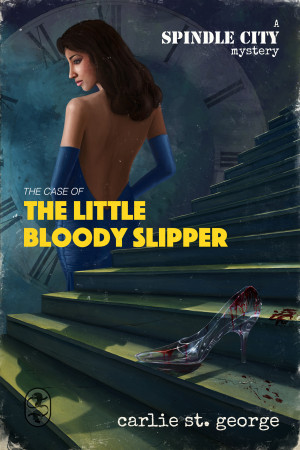
In which cover artist Melanie Cook talks about the process for The Case of the Little Bloody Slipper by Carlie St. George.
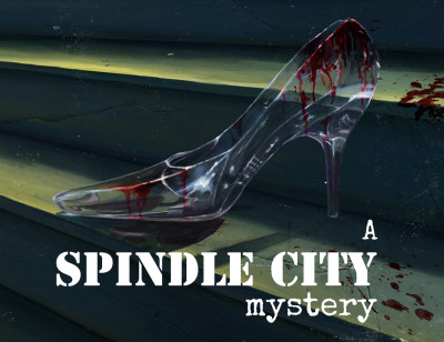
Today we are delighted to introduce you to Melanie Cook–the artist behind the gorgeous cover art for the first book in our forthcoming Spindle City Mystery series. Here to talk about the design process from beginning to end, please give a warm welcome to Mel, folks!
![]()
Back when I first began illustrating and designing and comic book-ing I was asked—prematurely, I think—to describe my process. It mostly amounted to running around screaming “The skies are falling!” while banging my head against a blank page. But thanks to the interwebs and the generosity of dozens of other artists who’ve detailed their processes and techniques online, I’ve gradually developed a more ordered approach. Hopefully I can offer something similarly helpful here.
The first place to quell your fears is with the manuscript. Read it through, and more than once. Don’t be afraid of the highlight function and, if you’re using a program that allows you to make editable annotations, even better. What I’m looking for when I read through a manuscript are iconic moments: plot points that leave me with a lasting visual impression, suggestions of story that don’t give too much away. With the fairy tale noir series, I’ve given myself the added limitation of picking moments that also hint at the underlying fairy tale. It isn’t enough to simply design a cool retro pulp cover. I want the reader to have the pleasure of recognising the tale that’s being subverted.
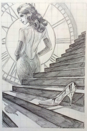
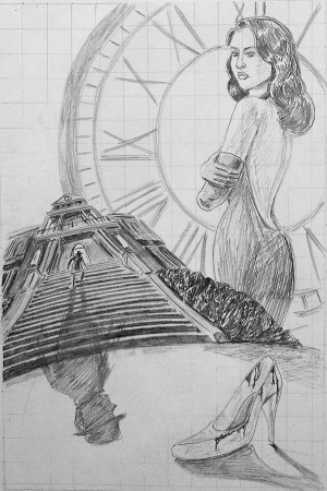
Once I’ve chosen a moment from the story, it becomes a matter of translating it visually. I start with a series of quick and nasty thumbnail sketches to help nut out composition. Five to ten variations are a good number to work with. The first couple will be easy to bang out, and you’ll be tempted to stop there (“But this is how I pictured it as I was reading it!”). Don’t. Challenge yourself. Often the design a publisher or client has gone with in the past has been the one I thought them least likely to take, the one I was hesitant to draw in the first place. Google Images can be a great help here. You wouldn’t think a set of stairs could offer up that many compositionally interesting options, but you’d be surprised. I often find new and dynamic angles by doing a simple Google Images search. There are a lot of people taking photos of stairs out there.
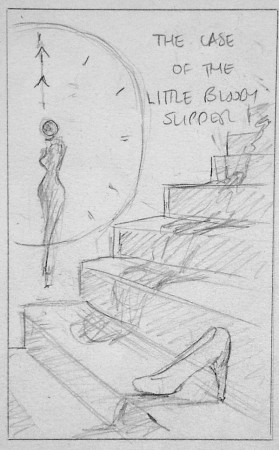
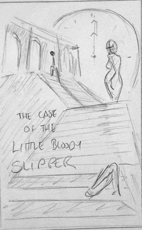
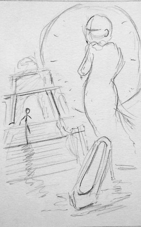
Thumbnails done, one or two will then be selected for further development: this is a no-holds-barred, full tonal composition—about as close to a finished design as you can get. Blocking it all out in shades of grey first allows any problems or misinterpretations to be identified and sorted out early. To save time I’ll often hobble together rough collages in Photoshop using reference images sourced from the web and embarrassing photographs taken of myself in awkward, and often compromising, positions. It’s an extra step in the whole process, but one which allows for quick and easy editing, and ultimately bolsters the final design.
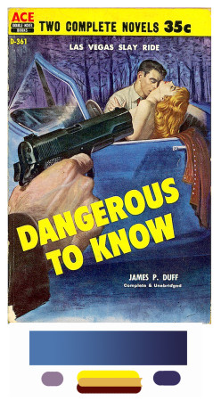
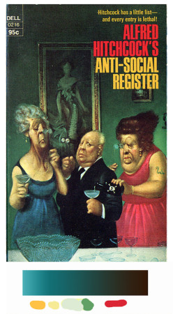
Before diving in to the final paint, I work out the colour palette. Again, back to Google Images. Given that we’re trying to emulate the feel of pulp noir from the 30s and 40s, it’s important for our palette to match. It’s probably one of the first things to subconsciously give a suggestion of era: bright, eye-catching colours printed on dull, wood pulp paper and aged with time. I’ll often spend a good hour or more trawling through the net for images (covers, posters, photos) that best represent the era, tone or style that we’re trying to emulate. With a little help from Photoshop’s eyedropper tool, it’s incredibly easy to source a ready-made palette online (or from photos you’ve taken yourself) and riff off that.
I haven’t talked much at this point about text layout, or font and colour choices, but, to be honest, I’ve never given them their own definitive stage. Obviously the layout of text should be considered as part of the overall composition, but often font and colour selections won’t be locked down until the artwork itself has been finalised. Typography isn’t my strong suit, and I tend to approach it as an ever-evolving process, so I apologise for glossing over it. There are people better-suited to teaching this subject than myself.
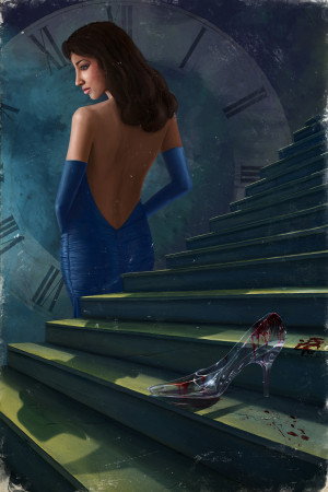
This brings us to the final stage: painting! Finally. This is where all the groundwork you’ve put in pays off. Grab your palette and your tonal study and your favourite playlist and let loose. Be bold and brash in the beginning and refine over time. Since I’m painting in quite a realistic manner, I tend to have a large stock of reference images to refer to as I paint: how might light travel through a glass medium and cast shadows on a stone surface? How can I use light and shadow and brushstroke to suggest a satin material? What did Dexter say in his very first episode about blood splatter patterns? It’s probably one of my favourite aspects to trying to paint realistically: you get to engage with the physics of the world around you. It can be frustrating, but mostly it’s incredibly rewarding. And there you go! That’s it! Pending final approval, you’ve got a finished book cover on your hands.
About the Artist: Melanie Cook
Melanie Cook is an illustrator, concept artist and writer. She has produced storyboards for the likes of Ridley Scott Associates and concept art for the award-winning short film Payload and the science fiction project Restoration. Her current projects include The Tyger and the forthcoming webcomic The Death of Negative Man. You can find her on Twitter (@melicook), Tumblr (melliecook.tumblr.com) or her personal website www.melaniecook.com.
About the Story
It was half past eleven when I saw her. She was standing at the top of the staircase, with restless fingers and defiant eyes, wrapped in blue silk that clung to her hips.
Jimmy Prince is a private detective with a tendency to make bad decisions, take on hopeless cases, and ask too many questions. But no one is answering his inquiries about Ella, the mysterious dame who slipped into the Prince family gala, stayed for a dance, then disappeared at midnight leaving just a single bloody glass slipper behind.
With the help of his trusty assistant Jack (a street-savvy teen runaway who is as tough as she is resourceful), Jimmy finally catches a break when one of Spindle City’s most powerful players, the Godmother, lets slip that Ella is part of a much larger conspiracy and not at all who she seems. With every new clue, Jimmy finds himself a step farther down a path that threatens to uncover some of the city’s best kept, and most deadly, secrets.
In Spindle City, all kinds of tales get told… for a price. Asking the wrong question is a guaranteed one-way ticket to the long and silent ever after.
Taking on this new case might just be Jimmy Prince’s biggest mistake yet.
Find out more about the Spindle City Mysteries and preorder your copy of The Case of the Little Bloody Slipper.
How to Get the Story
The Case of the Little Bloody Slipper will be published officially on November 3, 2015. You’ll be able to read the story in full for free here on The Book Smugglers, but we’ll also have a DRM-free ebook (EPUB & MOBI) that contains the story, a Q&A and an essay from the author, as well as fun extra materials about the series available for purchase on all major ebook retail sites.
Preorder the Ebook
Amazon US | Amazon UK | B&N | Kobo | Smashwords
Need a copy *right* now? Want to read it *today*? You can buy it directly from us!
Add the book on Goodreads, and read The Case of the Little Bloody Slipper for free online on November 3, 2015.


8 Comments
JazzFeathers
October 23, 2015 at 3:07 amFascinating seeing the process of creating a cover.
And this series sounds awesome by its own right 🙂