As an unabashed Susan Jane Bigelow fan (seriously folks, please read her woefully underated Extrahuman Union series), I am delighted that we are hosting the reveal of the cover for her next book The Daughter Star, the first in a planned series.
Behold! The Smugglerific Cover (and summary)!
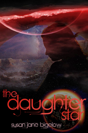
THE SMUGGLERIFIC COVER:
ABOUT THE BOOK:
What a rotten way for everything to turn out. Marta Grayline’s stable, fulfilling life as a freighter pilot has been yanked out from under her, she’s stuck on her miserable home planet with her obnoxious family, her beautiful girlfriend’s now on the opposite side of an interstellar war, and she’s bored to tears. What else could go wrong?
Never ask that question.
Marta’s enigmatic sister Beth offers her a way out by enlisting in the Novan Emergency Fleet, and Marta jumps at it. But it only gets worse from there; her ship is attacked and destroyed, and she finds herself stranded on a mysterious space station with a crew that won’t answer her questions.
And, of course, then there’s the aliens – the planet-destroying Abrax that somehow seem to have a hold on Beth. They’re coming for Marta, too.
Marta’s quest for answers will take her to the frozen dark side of a faraway planet, into the tense politics of a rebel base, through vast subterranean caves and into the heart of the enemy’s defenses. She’ll have to face ancient forces, her own doubts, and the inside of an alien mind if she wants to get some answers, complete her mission and unlock her own latent potential. The Daughter Star, the red beacon in the night sky, may yet be the key to the freedom and understanding Marta so desperately wants.
Artist Rio Griffiths on the design process:
One of the first things that struck me when I first got involved with the concept of The Daughter Star was how important the colours would be. The novel’s language is immediately evocative, not just of an alien galaxy, but of a completely alien atmosphere. It would be one, it seemed to me, where gradations of red, rather than the deep blue-black that we associate with our own skies, would be the point from which the inhabitants’ visual focus naturally worked outward.
I began to play around with transforming images that our eyes take for granted (seas, moons, rivers, the night sky, a wide-open space of fields under a bright sun) into the colour scheme that we more normally associate with fire. But this wasn’t enough.
The main protagonist of The Daughter Star was described to me as having many of the physical characteristics of a runner, but adapted to the atmospheric conditions of her planet. Instantly, I saw her in silhouette, a figure not immediately belonging to the sci-fi world – until you looked at her closely. Adapting pictures, however, would not be enough to achieve this. She had to be placed in surroundings that were slightly jarring to the eye even before the differences had fully registered; and fire tones, after all, are hardly something we are unused to seeing together.
On the other hand, we are always told to avoid placing blue and red in close proximity: it’s jarring, it’s not quite pleasant, and it seems (no matter how many times one may have lit a fire in the grate of a blue-painted room) slightly unnatural. I therefore began to adapt harsh shades of blue into the fire-toned background, and was astonished at how the silhouette immediately took on the aspects of a woman not quite of this world.
The final touch, strangely enough, came as the author, the publisher, and I struggled to find the perfect font, perfectly placed (all credit to Kate Sullivan, publisher extraordinaire, for being the one to find it!). The colours were taken from the cover, which turned out to have far softer shades in it than I had thought – so far, so good; the font was a delight; and everything was seemingly perfect. And yet something, somewhere, seemed to be missing.
I then realised what it was.
There is more than one protagonist in this wonderful book. The Daughter Star itself is of as much importance, and what better way to remind the audience of this than to show the Star; to have the planet beneath which ‘ignorant armies clash by night’, directly illuminating the text?
And then it came to life.
The most astounding part of this whole design process was, for me, the extent to which it was collaborative – that I was able to talk to both publisher and author about what was wanted, what could be improved, what (on my side!) was possible, and, best of all, what we could all be happy with. It’s been a delight from start to finish, and I’m still completely thrilled that I was not only asked to design this cover, but felt involved on an integral level with the final stages of such a marvellous enterprise.
Author Susan Bigelow on how covers are made:
One of the coolest parts of writing for a small press like Candlemark & Gleam is all the input I get to have when it comes to aspects of production like the cover, the font, etc. I especially love the cover process, because all I have to do is toss out some ideas, then sit back and wait for awesome to show up in my inbox.
When we first started brainstorming ideas for this cover, all I really knew was that I wanted something that was markedly different from the unique style of the Extrahumans books. Okay, I said, how about space. Because there’s space in this book! And it would be great to have Daughter, the red dwarf star, and Haven, Daughter’s tidally-locked planet (one side always facing the star, like the moon and Earth), as major pieces of the cover.
What Rio came up with is nothing short of astonishing. I actually gasped out loud when I saw the base image for the first time. There was the landscape of Haven, the redness of Daughter, the planet itself, and the haunting silhouette. The art is haunting in the way that writing this book felt, and I feel like it beautifully captures both the adventure and the emotion of the story. If you can’t tell, I’m incredibly excited to have this as a cover for The Daughter Star!
Read the first two chapters!
The Daughter Star by Susan Jane Bigelow is the first in a planned series following the Grayline sisters as they deal with intrasystem war, interstellar intrigue, a mysterious alien race, and the dangers of exploring your own soul.
Coming from Candlemark & Gleam in May 2013!


4 Comments
Heidi
March 14, 2013 at 9:39 pmYay! I love when an author actually gets some input on what their covers would look like, and the text alone on this one is absolutely fantastic (not that the art is bad, the text just really stands out for me). I really enjoyed the Extrahumans series (planning to gab about it tomorrow, actually), and I’m really excited to see the next thing Susan Jane Bigelow will do–it’s so different, but I’m sure it’ll be every bit as wonderfully unexpected and original.
E.J. Stevens
March 15, 2013 at 6:59 amUnique cover font. I think I’m loving it. Thanks for sharing!
xx,
E.J. Stevens
Pressing Matters: March 15, 2013, Edition | Candlemark & Gleam
March 26, 2013 at 4:43 pm[…] Daughter Star’s cover is no longer a secret! Stop by The Book Smugglers to see it, and to read how artist Rio Griffiths came up with such a beautiful, fitting design. And […]
Leeanna @ Leeanna.me
March 27, 2013 at 6:22 pmI LOVE that font! It’s so streamlined and perfect for the cover. It also makes me happy when authors get to have input into their covers.