Cover Matters is a new monthly feature in which we examine the medium that is first contact between a reader and a book: the cover. This feature will dedicate more separate space to a topic that has always intrigued, irked, and befuddled us. We will be talking about issues such as whitewashing practices, covers in poor taste, misleading or completely inaccurate covers, clichéd covers and, of course, covers that manage to get it right. We plan on having guests (bloggers, authors, cover artists, and publishers if possible) join us for these monthly pieces, with the following question in mind: Do covers matter?
In this month’s issue of Cover Matters we briefly analyze the results of 2010’s AIGA’s “50 Books/50 Covers”, followed by our look at some of the covers that Angry Robot produces as a counterpoint; and a guest post by Lee Harris, the main editor of the imprint.
Do Covers Matter?
AIGA – the professional association for design in the US – seem to think so. Ever since 1941 they have been sponsoring a contest (juried by luminaries of design and members of the publishing/bookselling industries) to select the 50 best designed books published in the previous year. The 2010’s “50 Books/50 Covers” have been selected and will be mounted as a public exhibition at the AIGA National Design Center in New York in December.
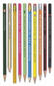
And here are some of the selected covers:
At first glance, these covers are awesome – clever, engaging, and to the point. And while the majority of the winning books relate to either literary fiction and non-fiction, there are also a few genre fiction (and genre-type art) titles on the list. For example:
Now, although a lot of the winning books and covers on this list share a certain artistic style (that is, clean and minimalistic), we do think there are quite a few titles – especially in the genre fiction and YA categories – that also deserve some love. Some of the covers and book packages designed by Tor (for example, the entire package for Cherie Priest’s Boneshaker with its heavy pages and sepia ink in addition to the awesome cover), Orbit, Pyr, Flux and others, also deserve mentions.
With that in mind, we give you the other part of this month’s Cover Matters, as we focus on Angry Robot and their approach to cover art.
Angry Robot is an imprint dedicated to the best of adult science fiction, fantasy, and everything in between. Since it first launched in 2009, we’ve been nothing short of impressed with the quality of their work – and that includes their approach to cover art. In an industry guilty of whitewashing and homogenizing, Angry Robot has some fine looking covers on its roster.
Take, for example, the covers for the upcoming Zoo City and the recently released King Maker.
Zinzi has a talent for finding lost things.
To save herself, she’s got to find the hardest thing of all: the truth.
An astonishing second novel from the author of the highly-acclaimed Moxyland.
One, we love the name Zinzi. Two, the book is blurbed by Bill freakin’ Willingham. Finally, both the US/Canada and UK versions are striking covers in their different ways – and we love ’em.
We’ve already blogged about King Maker…
On the streets of Indianapolis, the ancient Arthurian cycle is replaying in the lives of rival street gangs. Told through the eyes of King, as he gathers like-minded friends and warriors around him to venture into the fastness of Dred, the notorious crime lord, this is a stunning mix of myth and harsh reality. A truly remarkable novel.
But the same applies. Lovely cover, and we’re again thrilled to see PoC as not only the protagonist – but also being accurately represented on the cover.
More than just whitewashing, however, we also love the following Angry Robot covers:
You see what we mean? SO, when we were brainstorming who to invite for this month’s Cover Matters, who better than the editor behind all things Angry Robot – the incorrigible Lee Harris!
Please give it up for Lee, as he talks about covers and why they matter to him.
There’s always a lot of chatter online about the relative merits of cover art, and whenever editors and publishers join in, we keep saying things like “the primary purpose of cover art is to make people pick up your book”. This knowledge is injected into our veins on the day we first walk through the door of the publishing house. Seriously – it’s one of those truisms that we usually don’t even question because it’s been drilled into us so often, or we’ve lived with the knowledge for so long.
Over the last few years my reading circle has narrowed considerably – I’ve found myself reading more and more genre material to the detriment of my ‘literary’ reading (don’t get me started on that one). It’s something I’m aware of and am actively addressing. You see, I’d largely fallen out of love with non-genre titles, and like any long-standing relationship, it’s one that needs work. Don’t worry, we’ll be fine.
When I recently headed into a bookshop to choose a couple of titles for my wife, who is recovering from a minor knee operation, I was shooting in the dark. I knew the types of books she likes, and also some of her favourite authors, but I couldn’t be sure what books she already had, so the front-of-store promotional tables were my best bet. They’d probably have something in the right ballpark, and the books would be new enough that I could be certain she wouldn’t already have read them. When I’m buying for myself I don’t have that problem – I usually have a much better idea of what I’m looking for, and more often than not I’m looking for a specific author or title, following a recommendation or personal preference.
So, how did I choose which books to pick up? I glanced at the covers. Most covers didn’t even get a second glance. Some were good enough for me to scan a little more closely, and a very select few were good enough for me to pick up and turn over to read the back cover copy. In this context, of course, “good enough” means “close enough to what I thought I was looking for”. I wasn’t consciously following this pattern – it didn’t occur to me what I was doing until later on in the day.
There were perhaps 50 titles on the tables I looked at – a good hundred in all. Of those hundred titles, I gave maybe 20 more than a cursory glance, and picked up just 7 or 8 for closer inspection, finally settling on 2 to buy. And if the covers hadn’t been right it doesn’t matter what the back cover blurb said, they wouldn’t have been picked up, and ultimately purchased.
Many of the books on the table were adorned with absolutely beautiful artwork, but the art didn’t convey they type of book I was looking for. They might have been perfect – I’ll never know. This experience served to confirm to me what my colleagues almost always say when talking about covers – it’s not about making the book a beautiful object, it’s about encouraging casual browsers to pick up the title when it’s surrounded by a hundred others.
Don’t get me wrong – I love beautiful books, and often pay for more expensive limited editions when the cheaper paperback is available because of this love, but when commissioning a cover, the really beautiful art is the art that helps sell the book, pays the author and results in repeat work for the artist.
There’s no reason a book shouldn’t be attractive, but if the artwork doesn’t make a large number of readers pick up the title, then the book’s sales will suffer. Aesthetic beauty is a bonus.
So next time you’re browsing and pick up a book by an author you don’t know, ask yourself what made you choose that particular title to inspect? I bet it was the cover, and I bet there are more beautifully-adorned books on the same table that you never even considered picking up.
Thank you, Lee!
For more information about Angry Robot and the covers (and books) they have to offer, check out the official website HERE.




















12 Comments
Amanda Isabel
June 29, 2010 at 11:21 amGreat post guys!
Also … now expanded my list of things to bring home.
MikeMagpuyo
June 29, 2010 at 1:01 pmVery good argument. No question, the cover is mainly to blame when we pick up a book.
Also, excellent post, guys 🙂
KMont
June 29, 2010 at 1:30 pmThose are some great covers…but….Zoo City. I’m afraid I just don’t care for the one on the left. I cannot get over the dog face superimposed over the man’s. The cover on the right is gorgeous, though, and much more original, IMHO. Maybe the other is very true to the story, I don’t know of course, but it just makes me want to….laugh. *cringe*
I noticed Walking the Tree the other day. I like the cover, very compelling and odd and I had to know why.
orannia
June 29, 2010 at 3:03 pmI’m obviously weird, because the covers AIGA selected…don’t really work for me. I can’t really put my finger on why though (maybe too grim?), except for The Craftsman. I had to enlarge the cover to work out the title of the book 🙂
And thank you Lee. When I’m browsing, which I haven’t done of late *sob sob* I do look for covers that stand out. The sameness of covers erks me. (I see that often with historical romance.) BTW, did you wife like your choices?
Mrs. DeRaps
June 29, 2010 at 6:48 pmWhat’s interesting to me are the varieties of covers that appeal to readers. The same cover that a bunch of people think is awesome can look totally ridiculous to me. I love most of the covers that are pictured on this page. I’d pick up several and read the descriptions. I love, love, love looking at book covers. I could (and sometimes do) spend hours and hours looking at them in book stores. Thanks for this interesting post.
Gerd D.
June 30, 2010 at 5:58 amHah, me too. Most of ’em anyway. I’ve never been into overly artsy covers, that’s why of all the possible “Frankenstein” editions I have the Wrightson illustrated version.
Speaking of which, I take it “Frankenstein” is not considered being genre here? 🙂
And it’s so true, covers do sell books.
But, gladly not on their own, or my room would be filled up with spicy romances I’d most probably would never read…
“King Maker” is a fine example, great artwork, but I would never pick up the book because it looks too much “gansta-rap style” to me.
Which ain’t a bad, I’m pretty sure that is the audience it is targeted at.
Dyan Dutch
December 29, 2010 at 5:48 amMany thanks for your awsome post. I will keep an observation about your own blog, i allready saved it to personal list 🙂
Anonymous
December 29, 2011 at 7:10 pmCovers definitely matter for me. I imagine I passed up a few good reads because the cover was not appealing. 🙂
Great post. Awesome blog.
Elizabeth
http://silversolara.blogspot.com
Elizabeth
December 29, 2011 at 7:13 pmOops…I forgot to fill in the information to identify myself.
Elizabeth
December 29, 2011 at 7:15 pmThe pencil cover would catch my eye. That’s about the only one that does. 🙂
How the Robot Army Won AR’s War | The Robot Watcher
October 15, 2013 at 9:59 am[…] of some of AR’s most anticipated titles on a regular basis. The RA has recruited blogs of all types, most of whom give positive reviews to AR’s books and are more than willing to mention their […]
Best of Angry Robot: Covers | The Robot Watcher
October 29, 2013 at 8:45 am[…] of AR’s book covers. Indeed, many of these covers are awesome. Even the popular review blog The Book Smugglers did a post about some of their favorite AR covers. I would not be surprised in the slightest to […]