Cover Matters is a new monthly feature in which we examine the medium that is first contact between a reader and a book: the cover. This feature will dedicate more separate space to a topic that has always intrigued, irked, and befuddled us. We will be talking about issues such as whitewashing practices, covers in poor taste, misleading or completely inaccurate covers, clichéd covers and, of course, covers that manage to get it right. We plan on having guests (bloggers, authors, cover artists, and publishers if possible) join us for these monthly pieces, with the following question in mind: Do covers matter?
In this second issue of our Cover Matters feature, we will be talking about Clichéd Covers in Fantasy. Inspired by Aidan Moher (a blogger whose take on Fantasy covers are infamous for their keen assessment and criticism) and his post “I ask you: Clichés – A Double Standard” over at A Dribble of Ink, we will be addressing some of the questions he asked (Why are clichés shunned in the text of novels, but often embraced on the cover? Should publishers look for the same originality in their art departments that they seek in their authors?), as well as examining examples of both clichéd and original covers. We will discuss the rationale behind creating clichéd covers, and the idea of consumer familiarity. And finally, later in the day, we will have a guest article from Aidan himself.
Introduction: The Problem of Clichéd Covers
Aidan Moher from A Dribble of Ink is a prolific Fantasy blogger that consistently posts about and critically examines cover art. In one of his recent articles (the one that inspired this issue of Cover Matters ), he examines the irony of covers in fantasy – as publishers and agents are constantly on the lookout for fresh and original novels, and yet once these groundbreaking new tales are published, they invariably end up with a ridiculously bland, clichéd cover.
He proceeds to ask the questions: Why are clichés shunned in the text of novels, but often embraced on the cover? Should publishers look for the same originality in their art departments that they seek in their authors?
The ensuing discussion included opinions from readers and authors alike (including Mark Charan Newton and Peter V. Brett) , and this all points to a diverse melange of opinions and reasonings: one must take into consideration budget, marketing, the fact that the cover has a specific purpose (i.e. that of selling the book).
In 2009, Orbit – one of the major Fantasy publishers in the UK – conducted a survey examining cover art for Fantasy novels published in 2008 by all the big publishers in the genre. As you can see, the results point to a staggering over-use of certain elements: see the prevalence of “swords” and “glowing magic.”
Or, in a more visual approach, behold – examples:
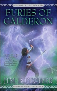
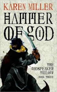
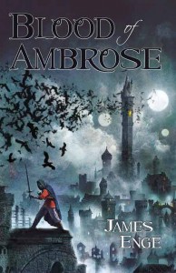
EXHIBIT 1: The Sword
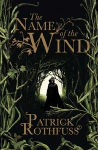
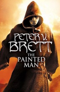
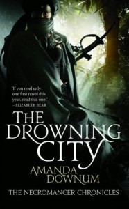
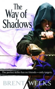
EXHIBIT 2: The Hood (even though not part of the survey, the hood seems to be an up-and-coming favorite)
EXHIBIT 3: The Hooded Figure PLUS The Sword
The evidence does seem to point towards a certain sense of… homogeneity. What exactly does this trend mean?
Familiarity versus Originality: The Debate
To the causal consumer (the silent mass that, despite what we internet dwellers may think, comprises the majority of readers), covers are often the strongest, most influential selling point for a book. In this sense, the commercial aspect of covers must be taken into consideration by publishers, since covers are a reader’s first introduction to a book. While the back summary, author blurbs, reviews, and general popularity DO matter, the cover is the first impression a book makes with a potential consumer. As such, covers must DRAW a customer in; they must give detailed hints about the style, genre and subject matter of the book.
This is where “familiarity” comes into play – because the casual consumer is more likely to pick up a book based on the cover (as opposed to us angry internetz peepul that read reviews, spark up impassioned arguments with other internet-cave-dwellers, stalk authors, and hound publishers for review copies), the marketing strategy often is boiled down to the following:
This is not only backed by the examples shown above, but also by Mark Charan Newton, who, in the aftermath of Aidan’s post wrote an article of his own, entitled Book Cover Conversations are so Very Cliched.In this article, MCN voices his opinion not only as an author of Fantasy novels but also based on his past experience as bookseller and as an industry professional (editor). He agrees that covers are “the single most important decision in selling books,” and proceeds to give his writerly/publisher point of view – namely that artists, book marketers, authors need to eat and familiarity sells. Hence, Mr. Newton puts a whole lot more emphasis on the marketing and commercial aspect of the fantasy book cover. (His post also hosts interesting comments from readers, bloggers and authors and it is well worth a read.)
This argument makes two key assumptions. One is explicit:
But this argument also makes a much more interesting IMPLICIT assumption:
It is this second point that is far more interesting to us – because, as MCN implies in his post publishing/marketing professionals “won’t be able to eat” if the decision is made to put up covers that don’t feature a hooded figure, or a sword, or glowy magic, or whatever.
To us, this seems to be a sort of self-fulfilling prophecy. Clichéd covers are supposed to work because they engender a sense of familiarity with readers; because some prior cover was successful, this very similar new cover will also be successful. But isn’t it possible that the majority of these repetitive covers are successful because they comprise the majority of the market? What other choice does the buyer truly have?
We are not industry professionals. Nor can we back our opinion with sales numbers (since we don’t have the thousands of dollars required to access Nielsen data). BUT, we feel that there is tangible evidence that runs contrary to these two assumptions. First, we assert that:
People DO buy different covers!
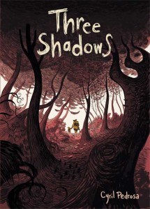
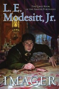
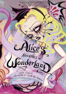
Macmillan’s (one of the “Big Six” publishing houses in the US) “Top Sellers” at this precise moment for SF/F contain a number of titles with distinct, original covers:
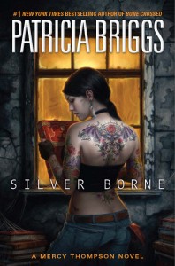
Patricia Briggs’ Mercy Thompson books with their gorgeous US covers designed by artist Dan dos Santos are immensely successful New York Times, Amazon, and Barnes & Noble Best Sellers (and yes, we’ve been trying to keep Urban Fantasy out of the discussion as that is fodder for an entirely different post, but we thought it was worth a mention)
At this moment in the top 50 SF/F Hardcover Bestsellers at B&N:
Granted, we don’t have the actual sales figures for any of these titles above. But provided that Macmillan, Amazon, B&N, et al are not pulling a fast one on us and lying about which titles are selling the best, there seems to be at least enough soft, third-party evidence that points to the contrary of this idea that originality is a death sentence for a fantasy title.
We’d also like to emphasize the main problem we have with this multitude of bland sea of homogeneity in terms of covers: these covers make the books inside indistinguishable from one another. They are nondescript and look like “just another Fantasy novel” without any zest or originality whatsoever. Doesn’t familiarity breed exhaustion?
Plus, no one seems to be asking the question that matters most to us:
At the end of the day, we understand that sales matter, and that artists and publicists and authors, etc have to eat. But this argument seems to forget that there are two sides to this relationship. Isn’t the reader’s money just as important as the publisher’s/author’s/artist’s? Doesn’t the publisher have an obligation to provide the reader with his money’s worth? Is it really ok for publishers to put out a slew of mediocre (ranging from bland to utterly hideous) cover art, so long as it sells? The reader also has to spent his hard-earned money and wouldn’t a better cover, a more artistic cover, or a cover that fits the book a little more closely be a better investment?
Other Problems with Cover Clichés
Another argument we’ve seen for homogeneous covers is the “Cost Defense.” There just isn’t really that much money available to publishers to put together lavish photoshoots or commission top artists to create something entirely original for every book. To this, we draw on a point Aidan has made before us – significantly smaller publishers such as Pyr and Night Shade Books, or imprints like Angry Robot are able to come up with drop-dead AWESOME covers for their titles – and we have to imagine that budgets for these smaller publishers are much lower than for the behemoths of the Fantasy landscape.
Is the true deciding factor that huge fantasy publishers (such as Tor/Forge, Bantam, Del Rey, and Ace) do not have the money to spend on their cover art? Or, rather, is their strategy “domination by inundation” – that is pumping out as many of the same looking books as possible?
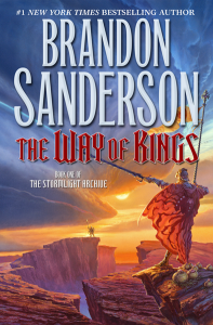
We agree with the basic precept that a Fantasy cover should necessarily signify consumers that it is a Fantasy novel – but there are better ways of accomplishing that without being stale and repetitious. There are effective ways to integrate familiarity with originality – just take a look at Brandon Sanderson’s The Way of Kings:
Nostalgic, but gorgeously rendered at the same time, The Way of Kings speaks to old and new fantasy readers alike.
Another question we find ourselves facing as we explore clichéd covers in fantasy and the arguments on both sides is the actual role that covers play in the complete package that is a published book. Covers are indeed a commercial entity, a marketing tool, intended to pique a customer’s interest – but it’s also a representation of the book, and, at its most basic level, a work of art. Art – meant to intrigue, to entertain, to provoke, to convey a message. A book itself is a tactile object and a work of art in itself. Books represent the dispersion of knowledge, the written enthrallment of storytelling – they are not just commodities meant to be sold.
Really Awesome Cover Art In Fantasy
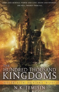
There are a number of truly original, awesome covers out on the market today, and we’d like to share some of these with you, dear readers. N.K. Jemison’s breakout 2010 debut novel The Hundred Thousand Kingdoms has a gorgeous, unique cover, and the Australian covers for Celine Kiernan’s Moorehawk trilogy are another example of big titles with lovely covers that sell. J.G. Lamplighter’s Prospero Lost is another striking one worth a mention:
Then, there are the amazing French covers for Brent Weeks’ Night Angel Trilogy, and Fiona McIntosh’s Valisar trilogy (both courtesy of Dark Wolf’s Fantasy Reviews):
Then, there’s this amazing article from SciFiMeld, featuring artists and authors talking about covers that they think just work brilliantly.
CONCLUSION
We understand that covers are a marketing tool and serve a very important purpose as the commercial representation for a book. Yet, we think that clearly, covers can be both artistic and commercially potent – one does not preclude the other.
Make sure to stick around as later today, we give the floor to Aidan, from A Dribble of Ink. Since he’s the guy that got us talking about the problem of clichéd covers in fantasy novels, we decided to pose the question to Aidan: Do Covers Matter?
Covers Matter
So, Ana and Thea want me to talk about cliches in cover art. That’s great. It’s something I’ve talked about before, and have a particular interest in. I was all ready to go on about self-fulfilling prophecies and publishing companies relying on flash-in-the-pan marketing trends (like those listed my my wonderful hosts) and shitty but familiar art (I dare you to look me in the eye and tell me that the art on The Gathering Storm isn’t of objectively poor quality) over wonderfully creative and interesting covers… but then I ran into this quote by artist John Picacio on twitter:
And, well… that basically sums up my thoughts about the matter. Diehard fans of the genre (like those passionate enough to blog, or wile away the day reading blogs) see so many book covers that they’re always pining for something new and exciting. Book Publishers (and, just as importantly, Book Sellers in major bookstore chains) want something that is going to immediately present itself as familiar and comfortable to their customers. No matter how long a marketing department spends on a project, if it looks like it was slapped together to please everyone (like the US Hardback cover of Joe Abercrombie’s Best Served Cold), it’s going to fail as art; similarly, you could put the most amazing piece of art on a cover, but if it doesn’t resonate with the target audience, it fails as a marketing device. The key, however, lies in taking those familiar elements and teaming them up with an artist who has creative license.
My hope, for any cover, is that it can succeed both as a lovely piece of art, and a powerful tool to get the book into the hands of readers. It’s just that that tricky middle-ground can be very hard to hit.
Trends and familiarity need not be mutually exclusive with striking art. One need look no further than Pyr Books, who take familiar ideas (like Jon Sprunk’s Shadow’s Son) and pair them up with amazing artists. If more publishers took this approach, I like to think we’d see happier fans and a lot more pretty books on our bookshelves.
But, hey, what do I know? I’m just a blogger.
Thanks, Aidan!
Links for Further Reading:
The Book Design Review (Unfortunately, on indefinite hiatus – but still worth looking through the archives)
Lit Mob’s Weekly “Judging By The Cover” Feature provides analysis of covers, interviews with artists, and other opinion pieces
Book By Its Cover – an aesthetically appealing site that (though light on actual commentary) takes a look at children’s book art and comic book art
Total Cardboard’s Retro Book Cover Design Gallery, featuring beauties from classic SF/F/H and pulp novels
Judge A Book…By Its Cover – another awesome collection of covers of the SF/H/pulp variety
Cracked.com’s “Best (and Worst) Fantasy & Science Fiction Book Covers”


















119 Comments
neth
March 31, 2010 at 10:33 amI’m a realist at heart, so I understand that covers need to sell books. But it is a slipperly slope that leads to some truly bad practices – such as the white-washing that you guys are so good at bringing attention to. When does making a cover that sells books cross the line? The old familiar argument for white-washed cover is that it’ll sell more books, but does that make it OK? On the same lines, the familiar argument for what people call cliche or simply bad cover art (or even stock art) is that it sells books? Is that OK? When is a line crossed? Is it?
heatwave16
March 31, 2010 at 10:37 amFor me, covers do matter. I am definitely a serial browser in my local Borders. If I see an interesting cover, I’ll pick a book up and read the description. For a new author, I think that might be away to get noticed. However, if the cover is terrible, but its by an author I’m familiar with, then I’d never not buy the book.
Covers help me discover new authors
Mark Charan Newton
March 31, 2010 at 10:53 amThanks for the linkage. It’s worth saying that those ‘original’ examples given are hardly anything even close to original. They’re all cliché in their own ways, each one a case of calling to a particular crowd.
But essentially it comes down to “I prefer this art better than that art”. Which is all well and good, but ain’t a useful discussion when it comes to putting bread on the author’s table.
Also, worth considering that yes, covers are the most important on neutral ground. But, if one book receives a huge marketing budget (and remember – those books on table displays cost a fortune to be put there), it will most likely sell a boat load more copies than one that doesn’t. It’s a business, at the end of the day, and it’s dominated by money.
Carolin
March 31, 2010 at 10:59 amGreats post from you guys! =) And yes, to me covers matter majorly. 90% of the books I pick out because their cover catches my eye and makes me want to read the blurb and see if it’s a book for me.
Also, I recently came across a youtube video dealing with the theme of urban fantasy covers. It’s really telling, IMO.
http://www.youtube.com/watch?v=AxSwr130ptw
Jess
March 31, 2010 at 11:04 amI HATE cliched covers. It makes books indistinguishable, and I’m NOT going to pick them up that way. My brain glosses right over the book when it looks like all the rest. Which explains why author’s names are being put into bigger fonts – a name I recognize on an otherwise bland cover will give me pause, though I think this is more common in romance and its subgenres.
But I’m not an average book buyer – I find books I’m interested in online and then go look at them. If I’m just browsing a store, I’m likely to look for books or authors I’ve heard of but haven’t looked into.
I’ve only bought two books in my LIFE because of their cover art. Scott Lynch’s LIES OF LOCKE LAMORA and Marie Brennan’s MIDNIGHT NEVER COME. Why? They were DIFFERENT and stood out to me. They both made great use of color and font, and gave me the book’s atmosphere to boot.
I wonder at the necessity of familiarity. These books are shelved in the SF/F section. The biggest distinction, then, is what type of subgenre are we talking. Epic sword-and-sorcery or urban? Dragons or wizards?
I think a good artist can convey that feel without needing to use familiarity as an excuse. The Lynch book above is a great example. The cover is expansive, detailed, and done in a classic fantasy style. Guess what the story is like?
KMont
March 31, 2010 at 11:04 amYa know, I had no idea that there was such a ruckus with SF/F covers. Some of the ones yall have labeled as homogeneous I actually like – a lot. I don’t think a sword or a hood means the cover isn’t fun to look at for it’s own merits.
On the other hand, I totally agree that ones like Boneshaker and The Hundred Thousand Kingdoms are MORE unique and pretty fantabulous.
I dunno, I think there’s room for completely different as well as the ones being called homogeneous. Eh, so subjective.
BUT, thanks for pointing these things out. As always, you’ve put a lot of good thought into the subject matter.
Oh, also, I don’t know why a publisher would say there’s not enough money to do a fabulous fantasy cover, the ones above that you’re saying all look the same – even if they were forged from stock photography, they were still done so in a creative way. They didn’t just snag those off of istockphoto.com. An artist or a designer at the very least had to create the thing.
Jess
March 31, 2010 at 11:13 amI agree, Mark, that the examples chosen by the Book Smugglers are perhaps not the best in terms of originality.
Something you said struck me: the covers appeal to a particular crowd. Well, of course. But is that maybe why I skim homogeneous fantasy covers? They’re in subgenres I’m generally not interested in, so they’re doing their job, right? I think not. If the cover were original, and distinguished itself from the hoard, whatever stands out might compel me to check it out, and read a bit more widely. There’s no chance of me doing that with the cliches going on now. My examples above, the Lynch book especially, are not books I would have ever bothered picking up if it weren’t for their covers.
So are cliches perhaps doing a disservice? As I already said, we know these are fantasy books from where they’re shelved, so that aspect of the marketing defense doesn’t carry enough weight.
Mark Charan Newton
March 31, 2010 at 11:19 amI think it’s also important to distance ourselves from casual readers – we are the committed genre-lovers who will be influenced by reviews and opinion. But it’s the casual buyers who make up the vast bulk of the readership that these covers are targeting. It’s something we forget – we are a vocal minority, and we shout very loudly indeed. To monitor the majority, all publishers really have is sales figures – and clichés must be working, because publishers keep doing them…
KMont
March 31, 2010 at 11:31 amI wonder if we expect too much of covers sometimes. With all the preferences out there, they’re just never going to make even a majority happy. Not likely anyway.
The idea of a cover snagging new readers, ones that don’t ever or usually read that genre, is great, though. This is a primo ideal in most marketing.
But there’s also always been the argument of the cover needing to reflect what’s in the story, and I think fantasy and scifi tends to succeed at this more often. Maybe authors need to write less sword-wielding, hoody-donned ruffians touting immense amounts of testosterone laden attitude? Maybe just a smidge? They might stop appearing on the covers.
But then I think some might miss them. Doh! And around the circle goes.
I dunno, I’m just glad I don’t ever see these in stores, but maybe if they’re there, I’m just blocking them out:
http://www.amazon.com/Bloody-Crown-Conan-Cimmeria-Book/dp/0345461525/ref=pd_sim_b_1
And oh hey – you know who came before Harry Dresden and his staff? Solomon Kane:
http://www.amazon.com/Savage-Tales-Solomon-Kane/dp/0345461509/ref=pd_sim_b_3
Sam Sykes
March 31, 2010 at 11:32 amApologies, but I can’t help but feel you all are being a bit selective with your choices here. While I don’t dispute that there are definitely some trends, patterns or even (gasp) cliches in covers, I don’t at all think it’s limited to fantasy.
Could you blame a YA book for having a young person on it? Could you fault a romance book for having attractive people in the throes of passion on it? Heck, if you want to get specific, Patricia Briggs’ book (excellent though they are) follow the tried and true Urban Fantasy pattern of tough-chick-in-tight-pants.
The thing is, it’s not just a matter of callous pandering to the fear of unfamiliarity. Some people actually like those covers. In fact, a lot of people do. I’d say the “cliches” are far more noticeable to bloggers because they read a far greater deal than most people.
Point being: if you look hard enough, you can find a cliche in everything. And if you’re going to call one genre on it, you’re going to have to call them all on it, otherwise it’s just kind of pointless nitpickery.
So…why go looking when it doesn’t really impact the book’s quality?
KMont
March 31, 2010 at 11:40 amBut the subject was *specifically* fantasy covers this time. This is a special segment the Smugglers do. Last time it was on whitewashing of covers. There’s a theme to each issue.
It’s not pointless nitpickery – it’s generating a discussion, isn’t it?
Thomas M. Wagner
March 31, 2010 at 11:46 amI’d suggest that above and beyond the matter of clichéd covers, you ought to consider a column on titles. To wit: just how many fantasy novels out there right at this moment have some variant of the word SHADOW somewhere in the title? There are two right on this page.
janicu
March 31, 2010 at 11:47 amMm, yeah the Patricia Briggs covers are gorgeous but they fit into UF cliches which is butt-shot and tattoos. And it kills me that I LOVE those covers but her tattoos keep changing (I think the author wrote around it but still)!
Some awesome covers still fit in the cliche. Like I still like the Brent Week Night Angel trilogy even though it has the sword + hood cliche going for it. And The Hundred Thousand Kingdoms has a castle/citadel on it which was one of the most used images on that chart.
katiebabs
March 31, 2010 at 11:47 amI’m all for “nitpicking” covers because some are just ridiculous looking. These above are very nice and appealing even with the swords and hoods.
Also what’s with a tree in the background of some fantasy sci-fi covers?
Can’t wait too see what you showcase historical romance covers. Talk about some major cliches there.
KMont
March 31, 2010 at 11:52 amBabs, so funny you mention romance covers – I was actually thinking about doing a post on them this weekend, asking readers if maybe it’s time for a change from the chesty, headless men. 😀
Sam Sykes
March 31, 2010 at 11:54 amOh, it’s definitely generating a discussion and, with this being a blog that discusses fantasy in no small part, it’s definitely worthwhile.
But at the same time, we can’t act like this is something that plagues specifically fantasy. If we’re going to discuss themes in fantasy covers, we should probably cover more than that if it is, in fact, a discussion.
Do we hold fantasy covers to a higher standard? Is it alright for historical fiction covers to share a theme, but not okay for fantasy? I realize that we are discussing fantasy covers, but surely this can be expanded.
Ana
March 31, 2010 at 12:02 pmSam, yes of course you are right that this is a problem that plagues most genres. In fact, I am generally very critical of Romance covers (as a Romance reader as well) and have in several posts talked about them. This is by no means, us nitpicking on Fantasy – this was the theme of THIS post and we do plan to go back to other genres (Romance, UF, YA) later. If we had talked about all genres this time, this post would have been endless.
And so we are clear, we decided to start with Fantasy because of the recent conversation at Aidan’s, MCN’s and Scifi Signal – But I wwonder do you think THEY are nitpicking on Fantasy? Or are your comments towards us based on the fact that we are not exclusivelly Fantasy readers?
Sam Sykes
March 31, 2010 at 12:10 pmI think, as I said earlier, that they nitpick covers because they see a lot of them. Your average blogger gets handed a lot of books, which he or she gives a lot of coverage on. Even if they don’t review it, at the very least they’ll have seen the cover at more than a passing glance. They have covers in their face as part of their duties as a blogger.
Not so for the average reader, as Mr. Newton pointed out. They see a few covers and like the ones that catch their eye.
But that’s the problem of the matter, isn’t it? Saleability, originality, and whether or not they’re exclusive. I don’t think they are, as you’ve pointed out a few that are pretty unique. But go too original, too artsy, and no one really can tell what the book is about at a glance and thus, probably won’t read further.
Delicate balance. It does remind me of what Scott Lynch said (admittedly about writing, but it works for covers, too, I feel): There are no bad cliches, only bad ways to use cliches.
A hooded man does not necessarily preclude a cover from being good. A hooded man that looks like that other book’s hooded man kind of doesn’t inspire a lot.
Thea
March 31, 2010 at 12:40 pmHi guys, and thanks for taking the time to read and comment on the post. I just wanted to jump in quickly and make a few comments of my own.
Mark – I think you make a very valid point in saying that different art appeals to different people. And I agree with KMont above too, insofaras even cliched covers can still look awesome. Point well taken.
But it’s the casual buyers who make up the vast bulk of the readership that these covers are targeting. It’s something we forget – we are a vocal minority, and we shout very loudly indeed. To monitor the majority, all publishers really have is sales figures – and clichés must be working, because publishers keep doing them…
The point that we did try to make in the post was that while Ana and myself clearly cannot afford access to the Neilsen Data and hard sales figures, from our cursory scan of the current bestsellers from outlets like B&N and Macmillan (Tor/Forge, etc) we saw a number of “original” (perhaps we should say, more original) covers on those lists – see BONESHAKER, ANGELOLOGY, et al above.
Surely there are ways to make book covers both aesthetically pleasing and different, and still sell well (as BONESHAKER, etc seem to indicate).
As readers and consumers as well as crazy-interweb people, I think we’re entitled to want a higher standard of cover (as opposed to yet another dreary gray hooded figure surrounded by mist).
Sam – What can I say, our point wasn’t to pick on Fantasy at all. It’s just, as Ana said, a discussion that has been pretty hot right now and we wanted to put our own thoughts down. If it makes you feel any better, rest assured that we WILL be doing a post for cover cliches in Urban Fantasy/Paranormal Romance, Romance, YA, etc. We do one of these posts a month, and this month, we decided to go narrow with a Fantasy Cover focus.
Regarding the Mercy Thompson Covers – In my opinion, these are the perfect example of a “cliched” cover concept that, by virtue of the high quality of the art and composition, totally rocks. There’s a huge difference between the Mercy covers and, say, a Rachel Morgan cover (*shudders*).
Janicu – Mm, yeah the Patricia Briggs covers are gorgeous but they fit into UF cliches which is butt-shot and tattoos. And it kills me that I LOVE those covers but her tattoos keep changing (I think the author wrote around it but still)
The tattoos totally aren’t on Mercy, you’re completely right – but Patricia Briggs has gone on record as saying that she’s totally cool with them because the covers are so pretty and capture the mood for her books perfectly. IMO, it’s an instance where artistic liberty is totally ok. But of course, that’s just my opinion 😉
Maili
March 31, 2010 at 12:48 pmFWIW, I avoid fantasy genre as a whole (for various reasons), but those times I did buy fantasy novels were due to eye-catching covers.
Fair or not, an unconventional fantasy cover implies the content inside might be different. Here are some examples that snagged my interest while browsing the Fantasy section:
The Lies of Locke Lamora by Scott Lynch
http://www.fantasticfiction.co.uk/l/scott-lynch/lies-of-locke-lamora.htm
In Great Waters by Kit Whitfield
http://www.amazon.co.uk/gp/product/images/0224079247/ref=dp_image_z_0?ie=UTF8&n=266239&s=books
War For the Oaks by Emma Bull
http://www.fantasticfiction.co.uk/b/emma-bull/war-for-oaks.htm
If I wasn’t already a follower of China M, I’d definitely pick this one up:
http://www.amazon.co.uk/gp/product/images/0333989503/sr=1-1/qid=1270064624/ref=dp_image_0?ie=UTF8&n=266239&s=books&qid=1270064624&sr=1-1
That said, I have a massive issue with the general state of US romance covers, especially clinch covers. Blegh.
Thea
March 31, 2010 at 12:49 pmAlso, one final thing, just because this point seems to keep popping up – Ana and I totally get that we are not representative of the “casual consumer” (as we say more than once in the post above). That’s not what this post is aimed at. Our central point with the post was to show that fantasy covers can both sell and be aesthetically pleasing/original.
danielle
March 31, 2010 at 1:08 pmMkay, so Sam, speaking as a young adult, I can personally state that I do NOT look for books with young adults on the cover. In many cases, they kind of repulse me. I don’t think its a matter of relevence to the genre, but how eye-catching they are, and thats where I disagree with the Smugglers; to me, and many young readers, it doesn’t really matter if its cliche or overused. If its done in an attractive way that draws the eye, I can garuntee there will be a good amount of people who will approach it.
KMont
March 31, 2010 at 1:09 pm*Surely there are ways to make book covers both aesthetically pleasing and different, and still sell well*
Definitely. Bottom line for me, I enjoy the variety. Hoodies, swords, something more unique – bring ’em all on. If it’s purty, I suppose I’ll like it for some reason or another. 😉
katiebabs
March 31, 2010 at 1:11 pmI’m all for the cover with a dude in a hood, holding a sword near a tree showing off his six pack, but that’s just me.
Celine
March 31, 2010 at 1:14 pmThe thing that amazes me about covers is the completely diverse approach from one territory to another in relation to the same story. I think the most hilariously off the wall was the German YA cover for Poison Throne in which they portray Wynter with multiple piercings, facial tattoos and a samurai sword!
Though I love all my Moorehawke covers, I must confess that the two approaches that appeal to me the most are the ones that took the path least trodden. That is: 1/ the First print run Irish Poison Throne cover which featured a raven holding a golden crown in its beak (it is still the cover that best reflects the story, I think) and 2/ the incredible triptych of black and white covers which Allen and Unwin did for the trilogy.
You can check out the Aus cover artist’s blog here, where she talks about how she approached the task of making three interlocking images for the three different books; yes there are horses – but horses are a big part of the second book. And yes Wyn is holding a sword in the final cover, but it is specifically a falchion sword and it is there to symbolise her having taken Razi’s burden of responsibility onto herself. The artist went to the trouble of reading all three books before she started the covers and spent a long time talking to me about symbolism, weapons and tack etc. I think this really shows too!
As for market reaction to covers. Book sellers have told me that the beautiful first edition Irish cover didn’t get the same browser reaction that the more generic second cover did ( the second cover featured a cat’s face) The cat’s face cover walked off the shelves apparently. The B&W Aus covers are a real eye catcher and get good browser reaction, though, which is encouraging. Hope this is helpful!
BTW In my opinion, Allen and Unwin tend to have really innovative and lovely covers. Their work on’Tender Morsels’ is wonderful.
Thea
March 31, 2010 at 1:18 pmDanielle – I (and I’m sure Ana too) very much agree with you and KMont, and other posters above in the sentiment that cliched covers CAN be appealing. See my comment re: the Mercy covers above! I’m sorry, we didn’t make that clear at all in the post, which is our bad.
It’s the covers like THE LEFT HAND OF GOD or NIGHTS OF VILLJAMUR that just don’t work for us – boring, cliched, generic and not particularly well composed. For what it’s worth!
Mark Charan Newton
March 31, 2010 at 1:56 pmWhat do you mean by “don’t work” or “boring”. What do you mean in terms of aesthetics?
It comes down to “I don’t like that picture/I do like that picture!” which isn’t a great way for a publisher to run a business.
Business professionals with years of experience sit down and have passionate meetings with sales teams etc., and decide on things, which cost a heck of a lot of money – and have a huge impact on careers and – at this level – livelihoods. Cover art isn’t just shoved up on a book randomly. It takes months of debate and carefully (one would hope) calculated positioning to the right audience and market.
It’s not guesswork, though some publishers – and I’m not naming names – throw a bunch of titles with different artwork at the wall to see what sticks and lo! a trend is born, an author is a success, and many others bomb. I tell you what – I know which publisher I’d rather be with – the one that sits down carefully to plan a career.
Sarah Rees Brennan
March 31, 2010 at 2:51 pm*clings to own sword-wielding cover, weeps*
All of course in the eye of the beholder – on a quick skim through the covers, I nodded to myself and thought ‘wow, yes, we DO see a ton of winged figure covers.’ Which is not to say the Angelology cover isn’t beautiful!
Jo
March 31, 2010 at 3:11 pmThank you for this thought-provoking post. Really interesting! I’m passing it along to my sci-fi/fantasy discussion group, as well. 🙂
Akin
March 31, 2010 at 4:10 pm“a hooded man does not necessariy preclude a cover from being good.”
Man, honestly, while I agree that some covers must have certain elements that tell readers, “Hey, this is a fantasy book,” or “Hey, this is a thriller,” I still agree with the smugglers. The Hundred Thousand Kingdoms has a huge castle and a face with flowling hair. Anyone who sees that knows it’s fantasy. But it’s also unique. I haven’t seen anything that good in a long time, as far as fantasy covers go, and that’s actually what made me buy the book (I’m not crazy on fantasy). Also, one of the reasons I don’t buy most fantasy books is cos of the swords and the bloody hooded blokes. Really. They almost all look alike. And if I had one bad experience with one book with a hooded dude, what’s to stop me from thinking another book with a hooded dude isn’t like the rubbish I just read with a hooded dude on its cover??
Secondly, I don’t think it cost that much money to make a unique cover, and I don’t think it’s that difficult either. All you need is a great idea and the artists are more than capable of doing the rest. I visited an artist site and looked at his illustrations – shocking. Awesome. Made me wonder why most of the book covers he was responsible for were all cliches. Then it occured to me that the artist could easily have produced soemthing great; the publishers probably wanted the cliche instead.
People act like making an original cover means climbing mount doom and bringing jesus christ from heaven and trapping him in the cover.
Emily
March 31, 2010 at 6:38 pmI think what’s interesting is that even if you look hard enough at a cover to find the cliche that is inevitably there in every cover, the cool thing is that if it’s done well, you won’t even care. (i.e Mercy Thompson books, Red Wolf Conspiracy).
Creating cover art is akin to writing the book. It’s all about using the cliches you and others are comfortable with, but putting a fresh spin on it to make it your own.
Stephanie
March 31, 2010 at 7:37 pmIt’s so funny you bring this up because about a month ago I lined up some “sword/hood” books I had recently bought: The Way of Shadows by Brent Weeks, The Drowning City by Amanda Downing, and The Innocent Mage by Karen Miller. And then I put all 3 next to my younger brother’s XBox 360 game Assasin’s Creed, and the two of us laughed for a good while. I enjoyed all three books, but the similarity between the covers and the video game is pretty ridiculous. But apparently that doesn’t matter because I bought them all anyways…? Ah, well…
Lindsay Elizabeth
March 31, 2010 at 8:54 pmI have mixed feelings on covers- there have been some covers on this site that y’all have loved and I have completely hated.
As an artist myself, I have to point out that some things that others might think of as “original” are actually from an art point of view very clichéd. For instance, the Boneshaker book uses a very accepted way to draw attention- one colored object in a background of gray or black. Also, trees are a big deal, because they are easy to draw, interesting to look at, and have good leading lines to draw the eye. I would think that a sword actually has the same advantage of being a good leading line.
I guess it’s just funny to me because I was browbeaten so often in photography to not do these things because they are so overdone… And of course it’s not all about the art, but also about what the publisher wants.
I love Sarah Rees Brennan’s posts on covers. I don’t know if they still exist or if they got deleted in the hacking, but she really drew my attention to cover trends in the different countries.
Thea
March 31, 2010 at 9:32 pmMark – Not a single comment regarding the B&N and Macmillan sales? I find it interesting that you keep zeroing in on the exact same points, here and on twitter, ad nauseam. But ok, I’ll play.
What do you mean by “don’t work” or “boring”. What do you mean in terms of aesthetics?
I mean what I said – the covers are boring. As in, according to the definition of the word, causing boredom, or tiresome. These are covers that I’ve seen countless times before and they DON’T spark any interest. I feel no compulsion to pick up the book, to read the blurb, or to spend heaven knows how many dollars on a hardcover version for it.
In terms of aesthetics, I mean, again, that these covers are boring. THE LEFT HAND OF GOD features a man in a hood, on a gray cover, surrounded by mist. There is NOTHING about this cover that excites me, or compels me to buy the book. NIGHTS OF VILLJAMUR features a boring looking dude with bad hair and a nondescript clothing doing an awkward, amateur sword move in front of a nondescript city. The color scheme is boring, the font is boring; it is an aesthetic dud, in my opinion.
It comes down to “I don’t like that picture/I do like that picture!” which isn’t a great way for a publisher to run a business.
Yes, but there’s also a matter of taste. There’s an empirical difference between a cover for HEROES AT RISK and the cover for PROSPERO LOST. What strikes me as a bad way to do business is for publishers to simply push out the same poorly produced covers over and over again. Clearly, it IS possible to put together a cover that is both aesthetically pleasing and sells well. Do you truly, honestly believe that these are mutually exclusive criteria?
Business professionals with years of experience sit down and have passionate meetings with sales teams etc., and decide on things, which cost a heck of a lot of money – and have a huge impact on careers and – at this level – livelihoods.
Yes. I completely understand what you are saying, and I’m not diminishing the role of business professionals, the import of their decisions on careers and livelihoods. But JUST because people are “professionals” does not mean that they are always right or always make the right decisions. As consumers and as reviewers and a part of the active reading community, it’s our prerogative to discuss covers or cover trends that we DON’T want to spend our own hard-earned money on. AND, as we say in the post above (I feel like a broken record), SMALLER PUBLISHERS ARE ABLE TO PUT OUT AWESOME COVERS ON A CONSISTENT BASIS. See (again! above) Night Shade Books, Angry Robot, and Pyr. Obviously I’m not privy to sales and cover budgets, but I have to imagine that these publishers have a much smaller budget than Del Ray or Tor or whatever other juggernaut SF/F publisher.
Again. All this has been said in the post above.
Mark Charan Newton
March 31, 2010 at 10:52 pmFirstly, smaller publishers can do that because they don’t have anywhere near the sales pressures. They sell copies in the hundreds and don’t have overheads in the same league.
What do you want me to say about Mac and B&N? Those covers are nothing original – they’re trite and dull in their own way, and I find it hilarious we’re assuming they’re innovative and amazing pieces of art. But no I’m not going to talk about their sales because it’s bad juju.
All you’re suggesting so far is that you don’t like a particular figure aesthetic. It’s crying out that you want YOUR preferences on a cover – which is fair enough, of course. But the buying public disagree to a large extent – they vote with their wallets. That’s what’s going to change things. Money. Unless you get out there and spent thousands of pounds on the books with the covers you like.
Thing is – there are qualities you claim are boring. Fair enough. But those books (mine hasn’t been on sale in that format yet), have shifted a lot of units. It works.
Just ask the buyers in the bookstores – not the customers, the chain buyers – you have no idea just what pressures there are in publishing to compete at the moment, and buyers will often say “I want this on a cover – it sells, it works”.
Also – it’s just as expensive to but the ‘bad’ cover art on as it is the ‘good’. Because, ultimately, it’s all about taste. I don’t like this. I don’t like that. Which you are entitled to.
Also – again! – every time you link to a cover you don’t like you’re advertising that book for free, and there are going to be a lot of silent readers who will be suddenly intrigued. So if you want to try to change things – stop showing covers you don’t like.
I hate to sound like a grumpy old man here – I’m really not – but I’m banging on about the same thing because – to me – it’s a debate that completely misses the point. A cover does a very different job to the content of a book, and I believe there’s not enough debate about the content – quality of prose, aesthetics of fantasy worlds, maturity of themes – then again I would say that wouldn’t I? 😀
Stumbling Over Chaos :: Lost in the linkity again
April 1, 2010 at 1:04 am[…] The Book Smugglers have a great post about cliched covers in fantasy. […]
Bella F
April 1, 2010 at 1:57 amI have no idea how to express what IMO makes a bad cover, but I know it when I see it!
I love the Mercy Thompson covers. And, though I haven’t read these, I also love the Boneshaker, Three Shadows, and Prospero Lost covers. But covers like the ones in Exhibit 1 and 3 are boring to me too. I see a cover like that, or like the 70/80’s looking one like this–
http://bit.ly/brCATn
and I just walk the other way to YA, lol. I liked the Icewind Dale story of Drizzt but would never have picked it up based on the cover.
Celine
April 1, 2010 at 2:24 amMark: Firstly, smaller publishers can do that because they don’t have anywhere near the sales pressures. They sell copies in the hundreds and don’t have overheads in the same league.
Ah Mark that’s unfair. Small publishers are barely clinging to life at the moment, and we all know it. Of course they have sales pressures – no publisher who is producing cover art of the standard being discussed here can afford to sell ‘in the hundreds’ The staff base may be small, but it must be maintained, printers must be paid, distributors and promotional folks dealt with, etc etc. No-one needs me to point this out surely?
I agree totally with you about the influence of booksellers and distributors on covers though. I know that Orbit went through at least four full cover versions of Poison Throne ( and I think Crowded Shadows) before they hit on the final cover approach – this included commissioning art for at least three versions. Much of those changes were as a result of close consultation with sales folks on the ground, dealing directly with book sellers who gave opinions on what would and would not sell.
Nonetheless Steve Stone and Peter Cotton ( the artist and design team) worked their arses off to make certain that the elements requested by sales ( young, active figures. Weaponry, castles etc) didn’t look tired, and they researched the books to include elements from each volume on the cover (right down to the type of foliage they framed each cover with – believe it or not this reflects the changing landscape in each book – this was not something they asked about, so must have come from their own meetings.)
Mark Charan Newton
April 1, 2010 at 2:27 amBefore I forget, I also want to quote Stephen Deas (on Twitter) on why it’s important to debate the content and not worry about cover art:
“Um, people can see covers and thus judge them for themselves. Not true of content. Hence review of content matters.”
Ana
April 1, 2010 at 2:40 amYou are going on about this here and on twitter, but no one, here, in the post itself or in the comments is saying that content doesn’t matter. Quite the contrary, most commenters are also bloggers who work a lot towards reviewing content. We do that every.single.day and rather in depth too , if I may so myself.
What we ARE saying is that covers matter AS WELL. To write ONE post per month out of more than 30 can hardly be described as wasting too much time on a subject that, at the end of the day, interest us.
To say that we are a minority and we don’t count sounds really dismissive to me. We are part of the buying public and we have the right to say what we think, to discuss anything under the sun as well.
Should we stop writing negative reviews as well? Isn’t that the same premise – but then discussion of content would end, wouldn’t it?
Ana
April 1, 2010 at 2:42 amCeline – thank you for your comments: they were really interesting and helpful. We adore the Australian covers of your book, by the way, a perfect example if what we are talking about.
Mark Charan Newton
April 1, 2010 at 2:57 am“To say that we are a minority and we don’t count sounds really dismissive to me. We are part of the buying public and we have the right to say what we think, to discuss anything under the sun as well. ”
I hope I wasn’t saying that, and sincere apologies if I came over like that. But we must appreciate that we’re a niche of a niche, and what matters for publishers is the majority…
Celine
April 1, 2010 at 2:58 amIt’s my pleasure, Ana. I’m glad they were helpful. It’s a subject that fascinates me in the same way old movie posters fascinate me. I think cover design is a neglected art form and the folks who work hard to get it right deserve recognition for their efforts and skill,so thanks for bringing it up occasionally.
Mark Charan Newton
April 1, 2010 at 3:36 amAnd of course, discuss anything you like. That’s what’s good about the blogosphere, and discussion of books – negative and positive – that’s all good. But when you begin to question covers and your debate hinges on “I don’t like these pictures” and come to a whole bunch of spurious theories, then we need to put things in perspective. We need to be self-aware of readers and how we fit into the genre – and the internet heavily skews that reality. I am guilty of that myself most of the time.
By the way, I know my views are unpopular here, but I stand by them as an ex-Bookseller, and someone who used to help decide what to put on book covers, and now someone who is between the covers. The reality is humbling. Covers are signalling devices for hitting the right market segment – and especially for those who don’t spend their time online deciding what to buy. Should publishers do what the few want, or cater for what sells, what chain buyers require (else they might not support it) and communicate in whatever way they can to the wider market? I’ve seen aesthetically bad covers sell huge quantities for nothing else – no support, no nothing – because of the commercial cover. And those sales support the rest of the line quite often.
To quote another Tweet (from another publishing insider): “Dear Internets: teh covers is *supposed* to look like dat. Kthxbai”
Empty Your Heart Of Its Mortal Dream
April 1, 2010 at 4:12 am[…] and the blogosphere is all a flutter thanks to a great article over on Booksmugglers about cliché fantasy covers. I myself, when reviewing books, don’t usually mention the cover art as it is completely […]
Jodie
April 1, 2010 at 5:22 amJust wanted to link you to a very interesting blog post from the Snowbooks people on this topic. They make the case that book covers need to sell to the masses, but they also do some sterling work as they design all their covers in house and many are very pretty and different looking (see the covers for George Mann’s series). So they seem to have forged an ideal compromise between the commercial need for familiarity and a bit of artistic freedom.
Jodie
April 1, 2010 at 5:41 amSigh and then I didn’t link to it, let’s try again shall we: http://www.snowbooks.com/weblog/2009/03/why_we_design_covers_the_way_w.html
Akin
April 1, 2010 at 6:01 amThis is the kind of bullshit myth that went on for years that black people on covers don’t sell; it’s bad for business. Let’s have white dudes and chicks on the covers, cos that would make us money and you know we’re on pressure to sell books.
Now it’s: man, we need to keep these covers generic. Hey, Robert Jordan did it – it sold. We should do the same thing. We don’t want to make changes.
Bullocks.
The only people likely to buy fantasy books with these generic covers are hard-core fantasy fans and people who have actually been sold on the content of the book.
I’m a casual fantasy reader. I walked into Waterstones once and went to the fantasy section. It was like staring at a book series that had 100 sequels – the same guy wearing the same clothes, wielding the same sword. Then I saw The Hundred Thousand Kingdoms, and that just drew me to the book.
You can’t tell me, Mark, that a lot of casual readers buy fantasy books compared to YA, which have by far the most creative covers in the business. I’m not saying YA sells mostly because of their covers; I’m saying fantasy books aren’t attracting new fans BECAUSE of their boring covers, simple as.
This isn’t 1909. This is 2010. Visual stimulation is the key these days.
As for your argument about business professionals sitting down and making informed decisions – to that, I say bullocks. Thea was kind enough to say she’s not diminishing the roles of business professionals.
Well, I am. Aren’t these the same business professionals who kept running their mouths about how ebook readers and ebooks were a waste of time? Look what’s happening. The iPad’s about to come out and they have their panties in a twist. These same “business professionals” decided to whitewash books for centuries, and when bloggers started complaining they ran off scared and made changes. I’m sure in all these instances, before the chatted rubbish about ebooks or decided upon whitewashing, they must have consulted booksellers, who must have said: “We are 100% sure that the readers will stick to hardcover until thy kingdom comes. Trust us. We’re the book sellers.” or “Listen, if you put a black person on the cover, I’m going to stick that book at the back shelf of my bookstore. It’s not that I hate black people – it’s just that people don’t buy books with black people on it.”
And in both instances the public proved them wrong. Publishers don’t know jack about readers or what readers want. Their system of doing things is stuck in 1823. Notice how everytime they try and second guess the public’s desire they fall on their faces.
There is a trend I’ve started noticing in a lot of blogs. When they review books they talk about how a cover works – whether it looks good or bad. It’s spreading, and this piece by the smugglers is probably going to increase awareness on covers. We both know when bloggers go on about something you don’t want to fight them. Bloggers have more powers than booksellers these days
David Ellis
April 1, 2010 at 6:08 amHe proceeds to ask the questions: Why are clichés shunned in the text of novels, but often embraced on the cover? Should publishers look for the same originality in their art departments that they seek in their authors?
Where did he ever get the idea that what he’s referring to as cliches in the text of novels (and what I’d refer to more neutrally as the tropes of fantasy and science fiction) are something publishers are trying to avoid? They aren’t (nor should they be—one can be as original with a story about a sword-swinging barbarian or hooded wizard as about anything else—it’s all in what you do with the subject; not the choice of subject).
And the same goes for covers. To suggest that a cover is cliched (again, a word choice that tends to dismiss as unworthy the tropes of this kind of fiction—tropes many of us find rather magnificent) simply because it has swords, dragons, etc, is nonsense—especially if that’s what features prominently in the story.
If you write a book that deliberately tries to avoid the tropes of SF/F then it’s understandable that author (or reader) be bothered by a cover that misrepresents the book. But the vast majority of the books put out don’t fall into that category. If a story is about a wizard who goes around whacking beasties with a glowy staff it’s hardly a bad thing to have that depicted on the cover.
Julianne
April 1, 2010 at 6:14 amI agree the cover art departments are leaning more towards cliches but haven’t they always sorta done that? How many Frazetta paintings made it onto Heroic fantasy covers in the 70s and 80s, or how many SF books have a spaceship on the cover? In the end? Does the cover really matter?If the cover’s gorgeous and the book inside sucks, what have you really accomplished? So I say, no. It doesn’t. Heck they could put a plain black cover on it, (ala Metallica) and I’d buy it.
I’m actually more surprised at the rash of headless women on UF and romance books. When I was a University student, the women’s studies department screamed to high heaven about how misogynistic such depictions were. So I’m shocked such headless women covers show up on books aimed at women.
But maybe that thought about the dirty little secret has been brushed under the carpet in the publishing art departments.
Will I buy UFs with the same type of covers? Sure, just as much as I bought SF and Fantasy novels with similar covers. Will I buy it because of a cover? Only in one instance: Get artist Robert Gould to paint that back shot of the headless woman, and Dude, I am a-snagging it!
Yes, I have actively sought out covers painted by Robert Gould, over the years. Nine times out of ten, I buy a book despite what the cover looks like.
David Ellis
April 1, 2010 at 6:14 amAs much as I love that cover to Inferno I can’t imagine why you’d consider that an example of a cover that avoids what you’ve been referring to as cliches. The prominently featured skull is one of the most common tropes in horror covers (also love the book–I’ve read it twice). And it’s a good illustration of my point: originality and quality don’t consist in avoiding widely-used tropes.
Mark Charan Newton
April 1, 2010 at 6:16 amDear Akin – I’ve tried to keep the debate polite, and I’ve a thick skin compared to some, but a bitter tone like yours is what keeps authors from engaging in online debates, so consider me walking away from this one. Believe what you have to believe, I just tried to highlight how the industry thinks on its inside.
PS – the black / white thing? That’s nothing to do with sales – I think people realised that it was racism.
Kia
April 1, 2010 at 6:17 amYou guys -really- should have mentioned Sanderson’s Mistborn hardcovers. 🙁
Akin
April 1, 2010 at 6:19 am@ David Ellis: those are blatant cliches. You put that crap out and I guarantee critics and bloggers will eat you alive.
The thing you need to understand is cliches will never die. Harry Potter, wands and wizards – cliche. The Hunger Games, reality tv with blood and guts – not cliche but becoming cliche.
The trick is to put a nice, original spin to these cliches. Make them interesting. Make people say, “Oh, wow, that wizard’s really cool,” or “Hey, I never thought vampires could do that.”
Same goes with covers. You can’t completely eradict wizards and glowing staffs and swords and what not. But try and put a nice spin to them. I swear, most of these covers actually look like they came from one comic book, only one book had page 1 of the comic book as it’s cover and the other book had page 3 of the comic book as its cover.
I mentioned this with The Hundred Thousand Kingdoms. The elements on the cover are in no way original. But they’re used to create something that looks different and beautiful and visually arresting. THAT is the point the book smugglers are making.
Hell, you know what, carry out a survey or something. Go out on the street and ask a bunch of people who don’t read fantasy books – show them Paul Hoffman’s “the left hand of god” and N.K Jemisin’s “The hundred thousand kingdoms”, ask them which book they’re likely to pick, and I guarantee they’ll pick Jemisin’s. They’ll also add, on Paul Hoffman’s book, “This shit is ugly.”
Akin
April 1, 2010 at 6:25 amDear Mark, the black and white thing ALWAYS had something to do with sales. Publishers want to sell books. They will do anything to sell books. The reason publishers are publishing books that sound like Twilight isn’t because they want to publish good books – it’s because they want to sell books.
The reason they whitewashed was both racism AND because they wanted to sell books. They believed (a) more white people read books than black people (b) white readers don’t want to see black people on covers. Hence whitewashing. But let’s not go into that. Today, it’s all about boring fantasy covers.
As for my tone, forgive me if I sounded harsh. It wasn’t my intent. If anything, my anger is directed mostly at publishers. They’re the ones who make the decisions in the end. I’m pretty sure most writers, if given the chance to work with cover artist, would probably come up with interesting covers. Publishers like to feel like they know everything readers want; they consider pretty much every other person’s opinion as baseless. That’s why they keep getting sucker punched with stuff like ebooks and whitewashing.
Really, like, did you not see ebooks garnering more supporting, especially in this digital age?? Everyone saw it. The music industry saw it. The movie industry saw it. Book readers saw it. Bloggers saw it. Publishers didn’t. And they were confident about it.
Again, sorry if I sounded harsh. I wasn’t directing my harshness at you 🙂
David Ellis
April 1, 2010 at 6:25 amSame goes with covers. You can’t completely eradict wizards and glowing staffs and swords and what not. But try and put a nice spin to them.
Isn’t that I said (except that I wouldn’t include that suggest that we ought to want to eradicate wizards and glowing staffs).
David Ellis
April 1, 2010 at 6:26 amSuggestion, I meant to say.
Akin
April 1, 2010 at 6:37 am@ David, yeah but you also made it sound like there’s nothing wrong with putting the same wizard striking the same pose with the same looking sword.
The smugglers are not the holy grail of cover matters. There’s bound to be at least one cover that they put up there that doesn’t fit the “bad cover” category. I for one like the cover for “The Name of the wind”.
But I still see what they’re saying, in that, these things are becoming common.
You know the funny thing – I bet if you opened all the books with hooded dudes on their covers, half of them wouldn’t even have a hooded dude IN the book. Lol
Akin
April 1, 2010 at 6:45 amI’ll give you a good example. Look at this cover:
That’s the german cover for the hundred thousand kingdoms. Nice, isn’t it?
But get this – though I haven’t finished the book, I am yet to come across a hooded female character. So, I’m like, why is there a hooded chick on the cover then?
See what I mean? Most of these covers are generic. They don’t portray what’s in the book. The publishers probably felt having a hooded woman on the cover was the right thing to do since the book was a fantasy novel. Now, if the publishers had given the book to the artist responsible for that cover and talked with the author and put heads together to pick out, say, a character or a scene from the book, and use that as an illustration for the cover, wouldn’t that be a lot more original?
katiebabs
April 1, 2010 at 7:07 amPublishers also need to be aware of their bumbling with stock photography. Case in point is with JR Ward’s first HC release. The male model on the cover was used before and many people noticed it and pointed it out, making the publisher and in a way Ward (who of course has no real say)look like fools.
And yet they still didn’t fix it, just tweaked it.
Gerd D.
April 1, 2010 at 8:22 amMaybe it’s because I come from Horror/Sci-Fi as a reader, but I don’t think that a cover _has to_ feature elements from the story, it only has to give a good idea of what I’m likely getting myself into, and most of time the covers do that for me.
I did find that Swords, more swords, yet another sword… gallery to be unfair; yes you could go all original and give Conan a M14 for a change, but I’d rather not. Also, one should not judge a painting by a single element, but has to look at the whole composition.
Though, I admit that I’m easily swayed to buy a book when I like the cover, and I barely care for acuracy if I alike the book. Case in point:
Nancy A. Collin’s “Sonja Blue”, my main reason to buy that book was the stunnigly gorgeous cover model of the German edition.
Patricia Brigg’s “Moon Called”, Dos Santos painting was just to awesome to pass.
Galenorn’s “Witchling” (I dislike the book, but still find the covers for that series amazingly beautiful).
And neither of them looks anything like the main character of the respective book (they don’t even fit the mood actually), but who cares?
My idea of how a book character looks seldom matches either… 🙂
Oh, and by the way:
Did you notice that there’s a dragon on the cover of “Dragon Keeper”, now how cliché is that!
I like that graph Orbit did, if they should do one for 2010 my prognosis would be that Angels will feature high in the list.
samosa
April 1, 2010 at 9:27 amWere you guys about to come up with exactly WHO made Prospero Lost‘s cover? I sent an email to the publisher of the book (6 weeks ago), but never got an answer? Any idea? Anyone?
– samosa
Maili
April 1, 2010 at 9:30 am@samosa
Sam Weber did Art and Jamie Stafford-Hill did Design.
Maili
April 1, 2010 at 9:31 am@samosa
Here’s a link to Sam Weber’s web site.
danielle
April 1, 2010 at 9:43 amAkin–there’s no blond chick, either! Well, I guess if you count that cousin…
David Ellis
April 1, 2010 at 9:56 am@ David, yeah but you also made it sound like there’s nothing wrong with putting the same wizard striking the same pose with the same looking sword.
No, actually, I didn’t. I took issue with the suggestion that the cover art is cliched simply because they have a sword, dragon, etc, on it. I specifically pointed out that originality depends more on the handling of the visual element than on it’s mere inclusion in the image created.
samosa
April 1, 2010 at 10:20 am@Maili
Woah. How’d you find that out? Because your a Sam Weber – Fan? Or … research? Please tell!
Escapist Newsletter (Vol 4 Issue 4) | Literary Escapism
April 1, 2010 at 10:54 am[…] The Book Smugglers have another addition to their Covers Matter feature and this time they are talking about the oh-so cliched Fantasy covers. […]
Escapist Newsletter (Vol 4 Issue 4) | Literary Escapism
April 1, 2010 at 10:54 am[…] The Book Smugglers have another addition to their Covers Matter feature and this time they are talking about the oh-so cliched Fantasy covers. […]
Akin
April 1, 2010 at 1:57 pm@ danielle: true. No blond chick, at least none that jumped out at me and made me think, “oh yeah, you’re cover material.”
@ David: in that case, we are in agreement
Erika (Jawas Read, Too)
April 1, 2010 at 2:08 pmI really enjoyed reading this post, even though my response is very late.
While reading and looking at the beautiful cover art, I began to think about what was said about those two words together: cover art. True, the cover of a book is a type of artwork, just like the book itself is. An artist and an author (who may consider her- or himself an artist) both work very hard to produce the final product. The author is at the mercy of readers; the artist who drew the covers frequently is forgotten.
Who do we blame when we call a cover “clichéd? The publisher and their marketing department for not pulling out the budget to give us a “better” cover. For not finding an artist to commission who does work we’ll like or appreciate or fawn over better.
The artist is hardly ever brought up. What does the author feel like when she or he receives a poor review? There’s lots of examples of this now since the internet has the ability to make public what otherwise would have remained relatively private. True, not all authors across all time have kept their silence upon received a negative review – some were and still are very vocal. The internet makes responding publicly extremely easy. Negative reviews boil down to opinion. What does the reader like or dislike about a book. What merits does the reader think this book may or may not have. Reviews are subjective.
So is the reception of art. In this case, cover art. How do those artist feel to have their work called “clichéd”? I think when we focus on not liking covers, we frequently forget that, the vocal component of Fantasy readers may not necessarily be the largest, nor do their opinions reflect or speak for the majority. Some Fantasy readers may like the covers we call clichéd. Clearly, some do not.
It all boils down to taste – a very subjective thing. The question of quality also comes into question since one could say liking non-clichéd cover art is liking the quality of that type of cover art over others. But isn’t arguing for quality cover art along the same vein as arguing for quality writing?
What does it mean to want a non-clichéd cover? 🙂 In terms of quality, that is.. just as we would ask of “quality” writing?
Maili
April 1, 2010 at 2:55 pm@samosa
Nah, I just have an interest in cover design. 🙂
David Ellis
April 1, 2010 at 3:22 pmI agree the cover art departments are leaning more towards cliches but haven’t they always sorta done that? How many Frazetta paintings made it onto Heroic fantasy covers in the 70s and 80s….
Not enough of them. The man created some of the most amazing fantasy illustrations ever to grace a book cover.
samosa
April 2, 2010 at 1:13 am@Maili
I see ^^
kay
April 3, 2010 at 9:38 amI consider myself a casual fantasy reader : it’s one of my favorite genres, but after reading (too) much of high fantasy in my teen years, I don’t read as much of it now. So when I pass in front of the “fantasy” table at my favorite bookstore, a lot of my attention will be taken by the covers. Of course, eye-catching cover doesn’t equal great writing and story ; but eye-catching cover does a lot to decide whether I’ll pick a book or not to read the summary, and if I do, than there’s a higher chance I’ll buy it than the book I left on the table. Clearly I’m not the only one here! 🙂
So I guess my point is : “boring” covers doesn’t mean they’re not beautiful. “The name of the Wind” and “The drowning city” are beautiful in my eye. But if all the hooded-figures books were put side by side on a table, these two are probably the ones I would look at first – and if I thought they were interesting, I’d buy them without looking at the other covers. My mind is guilty of two bad associations : great cover = great story, and similar covers = similar stories. Which of course I know isn’t true, but that’s still the impression it leaves on me! I’m working on changing that, but I can’t always help it!
Also, there is another association that can be made between similar covers, especially for a reader who doesn’t specialize his/her reading in fantasy, and it’s to think that two similar covers, seen in two different places, are from a same author. Looking at this post I just realized that Brent Weeks and Peter V. Brett are two different authors. Oops. I couldn’t have done that between “Boneshaker” and “The hundred thousand kingdoms” though!
Sorry I was long 🙂
ThisViewOfMine
April 3, 2010 at 8:35 pmI love the US hardback cover of ‘Best Served Cold'(and of course the book is great too). Srsly, the cover plus the title is what got my attention.
Im hurt that you say it ‘fails’ as art. Art is truely in the eye of the beholder and to say ‘any art’ fails seems wrong to me.
What may looked slapped together to you might not be to someone else.
Jim Stewart
April 4, 2010 at 12:10 amWhen I’m looking through a huge collection of unfamiliar fantasy/scifi novels, often the first thing thatdraws my attention is a cover that doesn’t contain cliches. I’m sure I’ve missed out on some good fantasy authors because the cover has a hooded hero with a lightning-sparking sword fighting a dragon over a chainmail-bikini clad elf girl under storm-tossed skies. And a fresh cover sure doesn’t guarantee good writing. But I’ve found at least a correlation. So count me as a data point against Newton’s case (though I love MCN’s work).
illukar
April 4, 2010 at 2:00 amGreat article and I agree that there’s a certain sameness in fantasy covers (and has been for a long time).
However, most of the covers you point out as original appear to be sub-genres (eg. urban fantasy, steampunk) which have their own set of cliches. Boneshaker, for instance – goggles and dirigibles are iconic to the steampunk genre. Beautifully executed though.
Moorehawke covers | Art Journal
April 27, 2010 at 5:16 am[…] then there’s this one which is a great article about fantasy cover art – the good the bad and the ugly! I love the […]
Random Scoop: Raging Against the Tattooed Cover Machine | Lurv a la Mode
June 8, 2010 at 2:02 am[…] by the way, I was intensely reminded of a post by The Book Smugglers when I was writing this rant, whereby they observed and commented on some cover cliches in more […]
An Aside | Cover Art Cliches for 2009 | A Dribble of Ink
August 16, 2010 at 10:44 am[…] an interesting, humourous look at the trends in the industry. It certainly shows that cliches are alive and well in the hearts of readers and the minds of graphic designers and marketers everywhere. Also of note […]
Jo Ann Bender
June 17, 2012 at 3:53 pmCover Art: Does it matter?
As the author of Rusty Springs, a unique adventure of today’s West, I knew EXACTLY what the cover should be and my Western
artist friend, Debbie Hughbanks, painted it much like I sketched it, outhouse and grove of aspens included.
When I worked for a medical book publisher as an editor, I was asked by the advertising department if I’d like to design covers. No, it was time to move from St. Louis with
a husband who was in the military.
If an author has an internal view that represents the underlying feeling of the book, then I believe it is a good
cover. There is no such thing ever stated as an EXCELLENT cover because we’re all subjective in how we view or how we
read.
Jo Ann Bender
my blog: lebensbornnovel.wordpress.com 😆
Cdraws
April 7, 2013 at 10:56 pmWow- I’m so late to this but I just had to comment. I’m an illustrator and have done my share of fantasy and sic if covers. I have worked for publishers as well as a growing number of self published authors. It’s interesting to note that the sp authors usually request the most cliche ridden scenes- perhaps because of their relative industry experience? Or because they imagine what the genre “looks like” and they want to fit in?
Anyway – I specifically wanted to comment on something that I disagree with but that most comments in this thread seem to advocate: that cover work is art. It is not art. It is illustration. Illustration and graphic design. There is a difference. Visual art can be used on a book cover. But if, at its inception, the visuals are created to market a book they are part of the advertising world. Beauty does not equal art. Most of the illustrations used as examples above are better than my work! But they aren’t art. I’m getting a little into the concept of what is art and what isn’t art but I just had to say that.
Writing Rules: They’re More Like Guidelines, Really (Part 3) | The Scriptors
January 5, 2015 at 6:52 pm[…] managed to find one article from The Book Smugglers blog that takes a more open-ended view of the discussion on cover designs in fantasy books. What makes a […]
19 Capas de livros clichês | Cheap Holiday Hotel
January 24, 2015 at 9:41 pm[…] thebooksmugglers.com […]
Luka-Micheala
February 4, 2015 at 4:48 pmWow…I’ve been whining about cliched covers for awhile! I think the cover really depends on who your target audience is. For example my audience are the YA crowd that likes anime, thus my cover will likely be reminiscent to either an anime art style or a position that would remind readers of such. I think people just have to take a giant leap outside what’s considered ‘safe’ in and on a book.
Book Cover Research | Pam Baddeley, Writer
July 27, 2015 at 10:11 am[…] when the market is heading in one direction, and this Book Smugglers article considers the cover clichés affecting the fantasy genre. In fact, this site has some sage advice on how to ensure your book is not immediately written […]
Judging a Book by Its Cover: 17 Typical Features of Fantasy Covers | Thoughts on Fantasy
December 28, 2015 at 10:04 am[…] of clichés on fantasy book covers and whether they are necessary, from The Book […]
Anonymous
June 30, 2016 at 1:06 amIt’s no coincidence. The first Assassin’s Creed came out in November 2007 and was met with huge immediate success. These covers are from 2008. Go with what sells.
19 Capas de livros clichês | Doggy Viral
November 11, 2016 at 4:11 am[…] thebooksmugglers.com […]
aecroor
January 28, 2017 at 8:02 pmThe more plain and unconventional looking the cover, the more likely I want to see what’s in (I find I like them more too, but maybe it’s because the majority of these books aren’t fantasy or sci fi. …). If the cover is too minimalist, then I tend to feel like it’s pandering to a certain demographic, thus, using the cover as a good way to grab a targeted group. Not much different from the glittery, seizure inducing fantasy art covers.
These fancy covers are usually ‘busy’. Good art, but it’s too much stuff jam packed on the sleeve. I’m reading a book, not a movie.
Well… anyways, publishers have to entice the consumer so there’s no getting away from these things.