Cover Matters is a new monthly feature in which we examine the medium that is first contact between a reader and a book: the cover. This feature will dedicate more separate space to a topic that has always intrigued, irked, and befuddled us. We will be talking about issues such as whitewashing practices, covers in poor taste, misleading or completely inaccurate covers, clichéd covers and, of course, covers that manage to get it right. We plan on having guests (bloggers, authors, cover artists, and publishers if possible) join us for these monthly pieces, with the following question in mind: Do covers matter?
This month’s issue of Cover Matters is twofold. First, we chat with Fantasy author Celine Kiernan, writer of the Moorehawke Trilogy (published in 10 different countries) about her different sets of covers. The interview is followed by the results of our Cover Matters’ survey which will be published in a different post later today.
Celine Kiernan is the author of The Moorehawke Trilogy, The Poison Throne, The Crowded Shadows and The Rebel Prince. The first and second books have been out for over a year in Ireland, Australia (and other countries) and are being published by Orbit in the US and UK this month. Set in alternate 15th Century Europe, the trilogy follows protagonist-cum-narrator Wynter Moorehawke as she and her dying father return home after a 5 year absence up North, eager to join up with her two childhood friends, the two brothers Razi and Allberon, only to find a kingdom in the throes of religious and political turmoil. We reviewed the first book, The Poison Throne over at Tor.com and you can read it here.
Given the assortment of covers and how different they are from each other, we thought it would be interesting to chat with the author about her extensive, interesting experience with covers, artists and publishers:
The Book Smugglers: You’ve had your Moorehawke trilogy published (or about to be published) in 10 different countries and with six different sets of covers – are you pleased with the results? Do you think all of your covers are representative of the characters, story, and/or overall tone for the series?
Celine: I think of all my covers, the ones that hit the mark in all three respects (story, tone and characters) are the Australian ones. They are quite simply stunning. Australian fans often take time to praise the cover art to me, this is, I suspect, very rare. (more about the Aussies later).
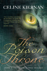
I have a real fondness for my very first Poison Throne cover ( the 2008 Irish edition) It was a rich and beautiful affair, possibly the one that most accurately reflects the feel of the book. It shows a raven with a gold crown in it’s mouth, and I especially like the fact that this cover opens out into the same map of the Europes and Moroccos that Razi, Wyn and Alberon pore over in The Rebel Prince – this was a lovely touch for me. But it must be said that even though this cover is one of my absolute favorites it was not, in itself, that popular with readers. This print run of Poison Throne sold out very quickly, and when the publishers went to reprint, they chose to use the German Poison Throne covers which showed a cat’s eye. This cat cover was one which I was never very sure of ( I was always afraid that folks would expect cats to play a far greater role than they do) but feedback from Irish booksellers showed a HUGE customer response to them.
The Poison Throne: 1st and 2nd editions by O’Brien Press (Ireland)
The first print run of Poison Throne sold out through word of mouth apparently ( in other words, folks came in specifically looking for it) but the cat cover walked off the shelves on it’s own merits, simply because folks were drawn to pick it up. Go figure, huh? Apparently cats sell. Now that’s something I never would have guessed at or known. Had I been asked my opinion on it, I probably would have said ‘no’ to the cat because I would have been worried about misrepresenting the story. This would have been dumb dumb dumb because, obviously, I know bubkas about marketing.
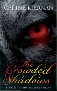
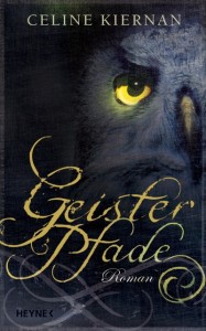
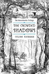
Speaking of the German covers, I’m not sure what to make of the owl that features on the German Crowded Shadows (Poison Throne is called Shadow Paths in Germany. Crowded Shadows is called Ghost Paths) It’s an awesome bit of cover art and very powerful, but I have no idea what it is meant to represent; perhaps the forest that that story is set in?
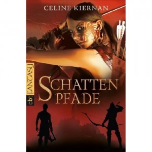
Even more disconcerting, though, is what readers will make of the facial tattoos, multiple piercings and samurai sword wielding Wynter that will apparently grace the German YA cover. I mean, it’s a great design, the girl depicted is one tough-looking broad (you gotta admire that in a gal) and certainly the cover is eye catching, but … um… yeah.
Words fail me there. I can only hope that the readers won’t be too pissed off when they buy a book expecting sword wielding kick-arsery and find themselves reading a bit of a slow-burn political character-study instead.
You ask me specifically about the Orbit covers a few questions down so I’ll wait until then to tell you my opinion of them.
The Book Smugglers: How would you describe the experience of creating these covers? Were you part of the process at all? How did one cover differ from the other? Did you have contact with any of the artists?
Celine: You can see from the answer below that I was very closely consulted on the Aus covers – but, saying that, I was only consulted about elements of the pictures that applied to me. Elise was determined to get the details right – but it was the Aus publishers who decided what those details would be, what the cover style would be, and how they would approach the design etc. I wasn’t involved in that at all. I had a good bit of contact with my Irish publishers ( they asked me to draw the map) and I had quite a bit of contact with Orbit as their cover designs progressed. But overall I had very little input per se (and there was no contact at all with any of my other publishers. )
As I said when discussing the cat covers, I’m not too sure that it’s important, or even ideal, for the author to be involved in the design of their books. Authors are all about the story – book covers are all about the market. It’s the rare writer who is also an excellent self promoter and salesman ( Mr Dickens, you may take a bow) and for us to put our all-too-emotionally-involved oars into the often very complex process of marketing our books would probably be a bit of a nightmare for the sales and design teams.
The Book Smugglers: we have to say, out of the four our favorite is by far, the Australian covers. Can you tell us a bit more about the artist and the overall concept for the covers?
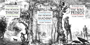
Celine: I had a great relationship with the Aus artist ( Elise Hurst) She spent a lot of time talking to me about what kind of building the palace was, what renaissance horses would look like, what kind of tack they might have, what the weapons might look like, what clothes the characters would wear etc. She also took the time to read all three books before starting the triptych and was very careful to match the tone of each cover to that of the story contained within; no easy task when designing the three covers as one long piece of artwork ( all three AUS books cleverly join together to make one picture, the trees that frame each cover being the linking point)
It’s not immediately obvious but there are many subtle details on the AUS covers which reflect aspects of the story ( my favorite of these being the ravens that flow from cover to cover; the way Wynter is still wear Christopher’s jacket on cover three, and most especially, the way she is carrying Razi’s falchion sword: this is such a subtle and lovely symbol of a moment in book three where Wyn takes up Razi’s burden when he can go no further.) Another huge reason for my love of these covers is the inclusion of Razi – it can’t have been easy to come up with a design that included all three major characters, so many story elements, and such a strong sense of drama without cluttering the page. Lovely.
If you have the time you should take a visit to Elise Hursts blog and check out the process she used to draw the triptych – it’s fascinating and shows just how much thought and work went into the production of this magnificent piece of art.
The Book Smugglers: Authors are so often caught in the middle of the Cover Wars between publishing decisions, marketing campaigns and sometimes the artists themselves. How do you view this situation – it can’t be comfortable?
Celine: Yeah, authors can end up caught in the cover wars, but really I’m not sure we have any place in them. After you have written your book and gone through the editing process, a whole new phase happens in the production process which really has very little to do with what’s between the covers. Its all about seduction, all about how to get folks to walk over and take your particular book from a crowded shelf. Next time you walk into a book shop, stop for a minute and just look at all those bloody books! Imagine an author you’ve never heard of, imagine their book which you’ve never heard of either, and now picture it lost amongst all those hundreds and hundreds of covers presenting themselves to you. At that moment a cover is all the author has. The story at this stage doesn’t matter a spit, because you, the purchaser, has never heard of it. At this stage in that unknown book’s life its cover is literally all it has to seduce you with. As authors we might not want to face up to that – but it’s a fact: the first steps of our literary career depend on a visual.
The publishers come under a hell of a lot of crit from purchasers for their marketing decisions – and sometimes for very good reason – but publishing houses aren’t one big person, they’re filled with individual teams of individual people working for individual books. A writer’s publishing team does an awful lot for them in terms of investment and sheer hard work, they often become very close to us personally and they are almost always 100% on our side and the side of our books. I don’t think a publishing team has ever once sat down at a table with an intention other then making sure the book sells; understanding that, it’s difficult and sometimes churlish for a writer to criticize the often complex decisions of the very people who are busting their arses for us, and whose careers are just as much on the line as ours if sales are bad. (Understand, I’m not talking about making weird decisions like electing to depict a black character as white, that’s just plain awful)
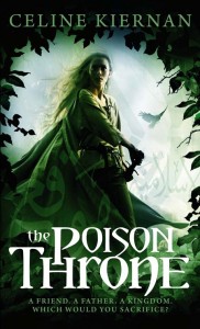
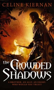
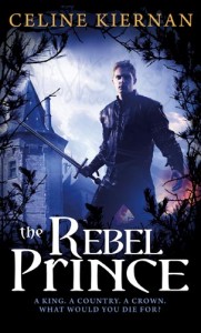
The Book Smugglers: This is probably going to be quite the controversial question but we can’t NOT mention it. As much as we love the Orbit covers, we have a few misgivings about them. The first cover, for The Poison Throne shows a giant, blonde warrior-like woman who we think is supposed to be your narrator: Wynter. However, Wynter is very petite and auburn-haired. Similarly, the cover for the second book, The Crowded Shadows shows a guy who we think is supposed to be Christopher. The third cover, for The Rebel Prince, certainly depicts Alberon. What happened to the fabulous, dark-skinned Arab, Razi, who is perhaps the main character of the trilogy?
Celine: Heh heh, my daughter hates the fact that Wyn has blonde hair on the Orbit cover, but I don’t mind because I know how many designs Orbit went through for the trilogy, and how much trouble Steve Stone and Peter Cotton (artist and graphic designer) went to in portraying the mood of the books while still keeping the sales team happy ( there really is a LOT of input from booksellers etc) As I said before, I think they did a fantastic job incorporating the elements that the sales guys wanted ( young, active, youthful figures, weapons, castles etc) while still keeping the covers fresh. If you would like to know just how much thought went into these covers, you can read more about them here.
I have to confess that I don’t think the girl on The Poison Throne cover looks like a ‘giant’ (there’s very little in the cover to put her height in context) Actually I think she’s a little small boned to be my Wyn (my Wyn is quite curvy.) But, sure, everyone will have their own idea of Wyn anyway and no picture will ever capture what is in our heads (which is why some covers try and avoid faces.) I suspect the cover artist found someone with the right kind of ‘vibe’ and went for it,( that cover girl does have a good ‘vibe’ going for her) I’m happy with that. Wyn is strong and determined, at the same time she’s young and a little overwhelmed – this is a good representation of that, I think.
Despite the full compliment of fingers, the lack of scarring and the rather supermodelish good looks, I’m pretty sure that is meant to be Christopher on the Crowded Shadows cover. Certainly he has Christopher’s long black hair and multitude of knives (it would have been awesome had he been wearing the Merron’s symbolic bracelets though!) Anyone who has read the book will recognize this very pivotal scene (though Christopher quite pointedly has no weapons at that point in the book, their inclusion in the imagery is very evocative of the mood of that particular moment.) I love this cover. It captures very much the atmosphere of this section of the trilogy. The choice of scene and character is very apt as Christopher and his people are vital to this story.
The author’s depiction of her characters
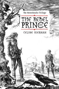
You’re right, for me Razi is the pivotal character in this trilogy. His actions and personality influence almost every other character and event in the three books. I’d be lying if I said I wasn’t initially disappointed in his lack of an appearance on the covers. But I fully understand where Orbit are going with the Rebel Prince cover. They needed the single figure motif to follow through all three covers, and this book is all about the Rebel Prince: it’s the book where we finally get to meet Alberon, after all that waiting it really does have to be him on the cover.
Razi will be getting equal billing on the limited edition promotional artwork which Orbit has planned for later on – you can be sure of that.
The Book Smugglers: You are something of an artist yourself and are writing the Graphic Novel adaptations for your books. Can you tell us how the process for creating covers for these will unfold?
Celine: Well, the graphic novel won’t so much be an adaptation, it’s a story in its own right, so the covers will follow their own rules. There is a certain plot thread which is left semi-unresolved in the trilogy – or should I say it is resolved off screen. I did this for two reasons; 1/ because its resolution was something which demanded more attention then I felt would have been appropriate to the books and 2/ the postponement of personal gratification for the greater good is one of the strongest themes of these stories. Resolving this particular conflict off screen fit into that theme very nicely for me.
I would very much like to tell this particular story in graphic novel format. As such, I’d love to draw it myself. God knows if I’ll ever get the time, graphic novels being so labor intensive, but if I do get to draw them, the covers would portray all four main characters, preferably in a vital scene from the story.
The Book Smugglers: Here at the Book Smugglers, we think about covers a lot, and we believe they are incredibly important, as both a marketing tool and as the artistic representation of the book. We also firmly believe that a cover can be both commercially effective AND artistically, visually appealing. What do you think about covers? Do they matter to you?
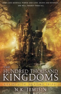
Celine: I think it’s pretty obvious at this stage that they do matter to me. Though I would never buy a book based solely on the cover, when browsing a book shop I am drawn to beautiful or interesting art, and I must confess if the cover is bad I won’t pick up the book. Sad, but true. A good example of this is The Hundred Thousand Kingdoms.
I saw the cover online and was drawn to it before I ever heard of the story – then I looked up reviews, thought it sounded interesting and bought it. It was the reviews that sealed the deal for me – but it was the cover that caught my attention in the first place. The cover is the first impression most people get of your book – if it’s dull or uninteresting or just plain ugly, it made be the only impression they ever get.
We would like to thank Celine Kiernan for chatting with us and for this incredible insight into the production of her covers.
And don’t forget, later today, we post the results of our Survey – the results are fascinating!





11 Comments
miss elise
April 27, 2010 at 12:15 amWhat a great article! Ahem though I am rather biased, being the books’ Australian editor! Just a wee correction: the artist was Elise Hurst, not Elise Jones. (To avoid confusion, some like to call us Helise and Jelise!)
Celine
April 27, 2010 at 1:58 amThanks so much for the chat guys, I really enjoyed it! i hope it answers some questions for folks, but if there are anymore, leave a comment and i’ll try and get back to you.
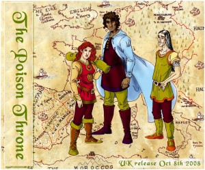
I think it’s hilarious that you chose that particular drawing of Raz, Wyn and Christopher because it’s my least favourite! The reason it’s my least favourite actually reflects quite a bit of what we were talking about in the interview! This was a promotional piece ( don’t know why it says UK – it was for Frankfurt) I had to re-draw and re-draw it in order to try and please a largeish team of promotors,they kept saying things like ‘Razi’s nose should be broader, Christopher looks too dangerous, take that hammer from Wyn’s hand, she looks too aggressive) and the end the characters just don’t look right to me at all.
If you’d like to see my actual idea of Razi and Wyn they are here and good representations of Christopher are here and here
Celine
April 27, 2010 at 1:59 amPS: apologies for spelling and punctuation above – a/ I’m slightly dyslexic and b/ I’m in a terrible rush this morning.
NatalieT
April 27, 2010 at 2:13 amAs an Australian, I thought it very interesting regarding the Australian covers. The beautiful cover of The Poison Throne was the key reason I picked it up at the library (and will reason in me ultimately buying my own copy eventually).
NatalieT
April 27, 2010 at 2:15 amOops – result in me buying my own copy – not reason!
Moorehawke covers | Art Journal
April 27, 2010 at 5:15 am[…] The full article is here […]
KMont
April 27, 2010 at 5:31 amVery interesting, ladies. I’m in agreement with the Smugglers in that the Australian covers are the best of the bunch. I didn’t think Wynter looked particularly big on the Orbit cover, but that’s just showing how everyone’s different in how they view things.
I think your point, Kiernan, about a cover being all the author has amongst the sea of books in a store is very true. I totally understand the logic that a cover has to be able to sell a book.
On the other hand, and maybe I’m not a normal reader anymore (some say bloggers aren’t), but I usually go to the store these days with a list of books in mind, having already read their back cover blurbs. I wonder how many other readers take advantage of the internet too, to research before actually going into the store. I know I personally don’t have time to contemplate a sea of books anymore, sad as that is. I need to know what I hope to buy before going in there. So I’m usually already armed with info on the book, aside from the cover. And when I look for books online, I really want that blurb along with the cover at least. I do agree that a cover can grab my attention, but I really need more than that to seal the deal. And I may just be repeating a lot of what was said above, apologies if so…
Li
April 27, 2010 at 1:26 pmThank you for this article – fascinating stuff! And I love the Australian covers, the detail is amazing.
I popped over to WHSmith’s ebook site to see if they carried the book (yes, I caved) and their cover for The Poison Throne is different again – this time it’s an actual throne?
Link here
Interesting how the forest/trees and ravens are a theme repeated across covers though.
Amanda
April 27, 2010 at 3:52 pmThank you all so much for this amazing post.
I’m an Australian book blogger AND spec fiction author and I loved reading this insightful interview.
I haven’t read the Moorehawk Trilogy – but now I will be. I would also like to give a HUGE HOOORAY to Celine for creating a very petite female lead character. I read lots of fantasy, thrillers and crime and I am sick to death of Carrie Bradshaw-types Glamazons (5’10 supermodels) which most authors seem to prefer.
Again, thnak you guys all so much. You’ve really made a great start to my work day!
This (combined with your kudos for Australian artists and publishers) is going to make me promote
Stumbling Over Chaos :: An Epic Episode of Linkity
April 29, 2010 at 12:03 am[…] Book Smugglers have a new monthly feature called Cover Matters. In this month’s post, they interview fantasy writer Celine Kiernan about her covers. They also posted the results of their survey on how much covers matter to […]
Escapist Newsletter (Vol 4 Issue 5) | Literary Escapism
May 10, 2010 at 10:08 pm[…] Celine Kiernan, author of The Poisoned Throne, by the Book Smugglers […]