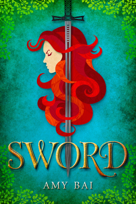
Today we are delighted to unveil the cover for a new upcoming YA Fantasy,Sword by Amy Bai!
Without further ado, BEHOLD! The smugglerific cover!
About the Book
Sword shall guide the hands of men…
For over a thousand years the kingdom of Lardan has been at peace: isolated from the world, safe from the wars of its neighbors, slowly forgetting the wild and deadly magic of its origins. Now the deepest truths of the past and the darkest predictions for the future survive only in the verses of nursery rhymes.
For over a thousand years, some of Lardan’s fractious provinces have been biding their time.
Kyali Corwynall is the daughter of the Lord General, a child of one of the royal Houses, and the court’s only sword-wielding girl. She has known for all of her sixteen years what the future holds for her- politics and duty, the management of a House, and protecting her best friend, the princess and presumed heir to the throne. But one day an old nursery rhyme begins to come true, an ancient magic wakes, and the future changes for everyone. In the space of a single night her entire life unravels into violence and chaos. Now Kyali must find a way to master the magic her people have left behind, or watch her world -and her closest friends- fall to a war older than the kingdom itself.
SWORD Cover Design Process by Jenny Zemanek:
I’m so thrilled to be at The Book Smugglers today to talk a little bit about the design process for SWORD. Working with author Amy Bai and Kate Sullivan from Candlemark & Gleam was an absolute pleasure, and I can’t wait for everyone to see the final product!
Amy and Kate came to me with a pretty clear idea of what they were looking for with SWORD’s design, but they also allowed me the freedom to take their ideas and run with them, keeping their minds open when I presented a few variations of their original concept. Obviously, with the title being SWORD, I thought a design that failed to include a sword would be odd, but I also didn’t want the cover to be a strictly literal interpretation of the title.
After reading the design memo, a couple things jumped out at me, namely protagonist Kyali’s long red hair. I was immediately intrigued by the contrast between the femininity of her long, flowing locks and the masculinity of her weapon, and it was that contrast that led to the initial design concept.
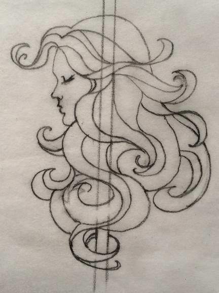
I collaborated with another illustrator to create a rough sketch of Kyali to present to Amy and Kate, her hair wrapping around her sword to create movement and flow.
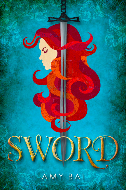
The illustration went over really well with only a few minor revisions, so I moved on to the comp stage. Amy and Kate mentioned parchment paper in their initial idea, so I kept that texture as the primary background but shifted the color to blue to really make Kyali’s red hair pop. Type is always a vital component of any cover, so I wanted to make sure the typeface we used reflected the same feminine/masculine contrast highlighted by the illustration. What we ended up with is a type treatment that has a few small flourishes, but is boldly roughened by texture.
While the overall design was a success, both Amy and Kate worried the background read too much like water, an element that doesn’t play a role in the story at all (but wait for book 2!). They suggested leaves or branches instead to reflect the mountain/forest setting, and their constructive feedback led to a much more successful final design!
Amy Bai on the cover:
I got to see the drafts and the tweaks and be a part of the process for this cover, and let me tell you, that’s an amazing and weird thing to do, when it’s for your own book. It’s such a strange experience, to have an artist take the story and characters that have lived in your head in words, and turn them all into an image. I can’t even tell you how thrilled I am with the end result. I only hope Jenny at Seedlings wasn’t expecting more feedback during the creation of this awesomeness, because I basically just replied with “Aaagh, those colors! Aaagggh, that hair! OMG, ANGRY EYEBROW FTW, I CAN NOW DIE HAPPY.”
I was totally helpful.
(But seriously, do you see that eyebrow? It’s coming for you.)
I’m not artistically talented—I mean, at all: stick figures are about my speed—and I’m the original Thawed Cavegirl when it comes to graphics, so if Jenny had told me she came up with the cover for SWORD by waving a wand and dancing thrice around a bonfire at midnight, I’d have believed her easily. Because there’s more than a little magic in this.
About the Author
Amy Bai has been, by order of neither chronology nor preference, a barista, a numbers-cruncher, a paper-pusher, and a farmhand. She likes thunderstorms, the enthusiasm of dogs, tall boots and long jackets, cinnamon basil, margaritas, and being surprised by the weirdness of her fellow humans. She lives in New England with her husband and her dog, and travels, with her husband (though not the dog, alas) as often as she can get away.
When she’s not writing in hermit-like solitude or plotting world domination via a silly-string war, you can catch Amy procrastinating on her blog.
Giveaway Details
Thanks to the publisher, we have five digital glaleys of Sword up for grabs! The sweepstakes is open to ALL and will run until Saturday, November 29 at 12:01am EST. To enter, use the form below! Good luck!


67 Comments
Erin
November 20, 2014 at 8:57 amGorgeous cover!
Katie
November 20, 2014 at 9:23 amI love this cover, and I really like the color palette used.
Mary Anne
November 20, 2014 at 9:42 amI like the cover – it’s a little different and gorgeous colors.
Stacey Balderrama
November 20, 2014 at 9:49 amLove the cover and seeing the process!
Kaethe
November 20, 2014 at 10:01 amI, too, love the color, and enjoy seeing the tweaks. But perhaps what I love the very most is just how ANGRY she is. I can’t think when I saw a female character on a book cover who was actively showing emotion, let alone being pissed off. Yay, for Angry Eye!
Shannon H
November 20, 2014 at 10:39 amI really like the cover despite initially thinking it was the Little Mermaid being stabbed. The colors are bright and catch, the design is simple and clean, and its a nice break from the rest of the genre.
Liza
November 20, 2014 at 10:48 amI LOVE it! Such an amazing process. So glad you shared the steps with us. Love the colors. And the FONT! WOW! That is perfect. It also has a look that makes it seem three dimensional. Very cool how the sword weaves in and out of the hair and the letter O in sword. Congrats to all!!!
Shae/Shelver @ Shae Has Left The Room
November 20, 2014 at 10:52 amLike? I LOVE the cover! Seriously, it’s going to be the focus of my next Cover Love. Wow. Gorgeous!
Nora
November 20, 2014 at 11:09 amGorgeous use of color! The style of it is very different from most of the genre’s offerings, so it’ll stand out from the crowd. And I’m with Amy on this one: “ANGRY EYEBROW FTW.”
hapax
November 20, 2014 at 11:20 amHoly cow, that is the prettiest cover yet.
Is is possible to purchase a print of the cover? I am totally serious — hapaxdaughter would completely plotz over that.
Teen Underground
November 20, 2014 at 11:29 amI LOVE that cover, and it’s interesting to hear how cover art came to be, especially when the author got included in the process. Thanks for sharing!
Meg Kassel
November 20, 2014 at 12:33 pmFabulous cover, Jenny! And oh, yes. The EYEBROW. Bold and fierce, as all the best heroines are. I can’t wait to read this, Amy!
Kara
November 20, 2014 at 12:43 pmI love the cover. I wouldn’t have said I would choose red, blue, and green for a cover, but the results are beautiful. Definitely a win.
Amanda Lee
November 20, 2014 at 1:16 pmThe cover is absolutely stunning- the colors just pop and the image is so fun and striking. I’d love to have the cover as a poster or something.
Amy Mays
November 20, 2014 at 1:16 pmI love the cover ! I’m really looking forward to reading Sword.
Amanda Lee
November 20, 2014 at 1:17 pmThe cover is absolutely stunning! The color just pop, and it has such a great graphic quality to it; I’d love to have it as a poster.
Becca
November 20, 2014 at 1:29 pmThe design is simple, but really cool regardless. This one sounds interesting!
Marie
November 20, 2014 at 1:30 pmI like the borders and corners of the covers. I confess I might like the blue one a little more for the feeling of age I also like the leaves.
Vilde
November 20, 2014 at 1:31 pmI love the cover, especially the way the hair intertwines with the sword. It brings a nice touch to the cover, and I love how the colour contrast was used to in a way intensify the colours that are on the cover! A beautiful cover work!
Vanessa Renee
November 20, 2014 at 2:12 pmI love the cover. Bold and understated at the same time.
Kate
November 20, 2014 at 2:31 pmA note to everyone who’s commented that they’d love the cover as a poster: we’re actually working with Jenny to see if we can make that possible! If nothing else, we’ll likely be offering book bundles when the novel releases in January, in which you can get a special edition that will come with a poster. Because the Angry Eyebrow must be shared!
Kate @ Candlemark & Gleam
tanita
November 20, 2014 at 2:54 pmOoh, the textures – the fabric-like effect on the hair is really nice on the cover. I like the cut-paper feel very much.
I look forward to hearing more about this one!
Katrina
November 20, 2014 at 3:44 pmThat hair, right there, is pretty much my teenage dream.
Melissa @ Bookmark Dragon
November 20, 2014 at 4:40 pmI love that cover! The colors are so vivid – it really makes an impression. Lovely!
Katharine O
November 20, 2014 at 6:01 pmThe cover is beautiful – love the rich colors!
Sabrina
November 20, 2014 at 6:01 pmI do like the cover – I appreciate how unique it is! And I love the story of how it came to be.
Rylie
November 20, 2014 at 6:15 pmI love the cover!
Steph
November 20, 2014 at 6:53 pmI am loving that cover. I really like how we got to see the process of making it. There are so many good covers out there, but sometimes we don’t get to see the story behind them!
wandering-dreamer
November 20, 2014 at 7:04 pmI love the paper-cut illustration style art so I totally dig the cover!
adrienne gillespie
November 20, 2014 at 7:05 pmLove the cover. And I really enjoyed reading about the design process.
Anna F
November 20, 2014 at 7:29 pmLove love love the cover
erinf1
November 20, 2014 at 8:16 pmit’s gorgeous! thanks for sharing!
Becky C.
November 20, 2014 at 8:19 pmLove the cover
Kyla @ Carmel & Kyla
November 20, 2014 at 8:56 pmSQUEEEE~ I love the cover! It’s so simple but lovely. The girl on the cover somehow reminds me of Merida, from the Disney movie BRAVE. I CANNOT WAIT TO READ THIS BOOK! 😀
Tina C.
November 20, 2014 at 9:04 pmLike?
No.
I love it!
Alexandra the Great
November 20, 2014 at 9:06 pmI love the colours on the cover, but the Angry Eyebrow TM takes the cake. Looking forward to this one!
looloolooweez
November 20, 2014 at 11:17 pmYeah, the colors are really eye-catching, but I especially LOVE the hair textures. Also, thanks for hosting this giveaway!
JoLee
November 21, 2014 at 12:03 amAbsolutely gorgeous.
Tünde
November 21, 2014 at 4:03 amI would read anything that has a cover with a hair like that on it.
Pili
November 21, 2014 at 7:28 amThe cover is absolutely stunning! Jenny did such a great job!
I love how the sword is entwined into the girl’s hair like that!
LS
November 21, 2014 at 7:32 amThe cover is wonderful! I like how it looks almost like a collage, with the different shades all distinct and textured.
Jill T.
November 21, 2014 at 8:10 amI do like the cover–especially the eyebrow. And I’m very fond of the fact that it’s not a photoshopped photo. There are just too many of those right now.
Amy in Austin
November 21, 2014 at 9:30 amSo excited to read this book!
Serena
November 21, 2014 at 11:15 amBeautiful cover! Reminds me of Brave.
Roshan
November 21, 2014 at 11:49 amBeautiful cover! I worked for several years as a bookseller, and I totally judge books by their cover. Bad cover art can be so unfortunate! And good cover art, like this book, is so eye catching, and can make a browser pick up a book because they think “oh, that’s so pretty. I wonder what it’s about?”
Cathy
November 21, 2014 at 1:09 pmThis cover is gorgeous!
Isabel
November 21, 2014 at 1:12 pmLove the cover, especially seeing the older versions/ process. I think that the green leaves give it a very cool look, especially with the color of the hair. I’m intrigued by the angry, determined look in Kyali’s face– I always love a good story about angry, determined girls!
Kate
November 21, 2014 at 1:14 pmLove seeing the progress of the cover from beginning to end. Can’t wait to read the book!
Lexi
November 21, 2014 at 3:41 pmYes, I do like the cover, but at the same point, who is going to say no?
Melissa (Books and Things)
November 21, 2014 at 4:48 pmJenny! I love it! I love seeing how you do these. I want your talent!!
Elliot
November 21, 2014 at 7:21 pmThe cover looks like paper art, I love that decision to use that style. And I second the delight at how pissed off she looks!
K. Hutton
November 21, 2014 at 7:27 pmLooks pretty cool!
Mary Preston
November 22, 2014 at 4:12 amFabulous cover.
Cristina
November 22, 2014 at 10:21 amI LOVE the cover!! Gorgeous!
Jen
November 22, 2014 at 10:50 pmI LOVE the cover. The trend towards illustrations in YA cover art is something that I hope continues, and this cover in particular is gorgeous. I love the way the sword is entwined with her hair!
Liat
November 23, 2014 at 3:09 amI love the cover! The colors are so pretty!
Alison
November 23, 2014 at 3:48 pmGorgeous cover!
Emily
November 23, 2014 at 5:11 pmThe cover is gorgeous and the book sounds fantastic!
C
November 23, 2014 at 7:14 pmGreat cover, it would definitely catch my eye in the bookstore or while browsing online.
Kaylie
November 24, 2014 at 12:47 amWow, this cover is absolutely beautiful! I love the colors and how it’s illustrated. I reminds me a bit of the cover of Thorn by Intisar Khanani.
Stephanie T.
November 24, 2014 at 4:13 pmI love the simplicity of the cover but am definitely impressed with the amount of work and forethought that went into it 🙂
Rachel Marie
November 24, 2014 at 5:01 pmI love the cover, the colors are absolutely beautiful!!
Diego
November 24, 2014 at 9:24 pmI do really like the cover and it’s colors
Allison
November 25, 2014 at 3:14 pmThis is gorgeous. So simple, but lovely.
Mayra barrera
November 26, 2014 at 8:11 pmI am in love with the cover!
charlotte
November 27, 2014 at 10:21 amtruly this looks lovely!
Nancy
February 9, 2015 at 10:10 amAbsolutely stunning! I can’t wait for tomorrow’s release.